Screenshot style breakdown
Sampled from 4 of Emulatore: GamePod Emu's App Store screenshots — background, accent and theme, measured by LaunchShots (not something Apple publishes).
#1C1C1C bg
#3B3B3B
#146CA4 accent
#FFFFFF text
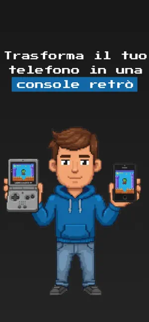
- #1Trasforma il tuo telefono in una
- #2i Supporta tutti i tipi di
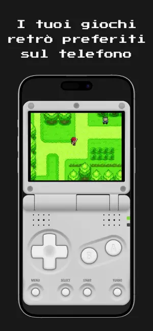
- #3I tuoi giochi sul telefono
- #4Libreria di giochi illimitata
Captions read from the screenshots (OCR, may contain small errors): 4 headlines, 5.3 words on average (longest 6).
Screenshots


Icon palette
About this app
GamePod - Il tuo caveau di giochi retrò. Rivivi l’età d’oro del gaming con GamePod, un emulatore e launcher retrò dal design raffinato, creato per semplicità e nostalgia. Carica le ROM legalmente possedute e goditi prestazioni fluide, grafica pixel-perfect e supporto per controller. Il tutto racchiuso in un’interfaccia pulita ispirata allo stile 8-bit. Caratteristiche: Supporta diversi formati di console classiche (GBA, NES, GBC e altri) Organizza e sfoglia la tua libreria con copertine pixel-art Emulazione veloce e stabile ottimizzata per dispositivi moderni Salvataggio automatico, supporto controller e feedback aptico UI e animazioni retrò che riportano all’atmosfera anni ‘90 Disclaimer: GamePod non contiene né distribuisce file di gioco. Gli utenti devono fornire le proprie ROM legalmente ottenute. Classificazione età 13+ a causa di potenziali contenuti maturi nei giochi aggiu…
App details
What you can learn from Emulatore: GamePod Emu
Every shipping app on the App Store has gone through the same decisions you're working through right now: which screenshot goes first, what caption sits over it, which device frame to show, what color the background should be. The 4 screenshots above are Emulatore: GamePod Emu's answers to those questions — they're public, they're real, and they made it through Apple's review.
What the numbers say: Emulatore: GamePod Emu runs a dark set with one background colour (#1C1C1C) carried across every screenshot — the listing reads as a single poster when the shots sit side by side in search results. The accent colour we picked up, #146CA4, is the one to reuse for badges, arrows and highlighted words if you borrow this look. Hit Use this style to open the editor with these exact colours and drop your own screenshot in.
Notice the first screenshot in particular. It's the one users see in search results and on the product page, and it's where most apps spend their best caption and tightest design. Look at the proportion of background to phone, where the text sits, what one thing the image is trying to communicate.
Want to see how other Entertainment apps approach the same problem? Browse more Entertainment apps in the showcase.
Take what works into your own screenshots
Open LaunchShots and design your App Store & Google Play screenshots — pick a device frame, drop captions, ship in minutes. Free, in your browser.
Open the screenshot editor →Apps with a similar look
Closest background + accent colours among the listings we've analysed — useful when you want to see the same palette handled by a different team.