Chart position — tracked daily by LaunchShots
Screenshot changes — detected by LaunchShots
Screenshot style breakdown
Sampled from 6 of RYDR's App Store screenshots — background, accent and theme, measured by LaunchShots (not something Apple publishes).
#FCFCFC bg
#DDDDDD
#6C8454 accent
#111111 text
Screenshots


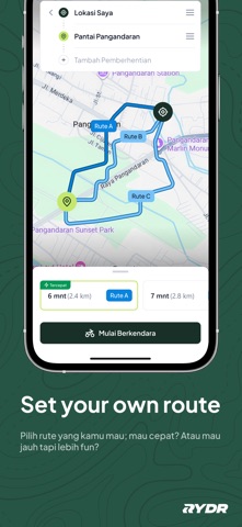
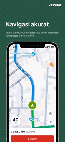
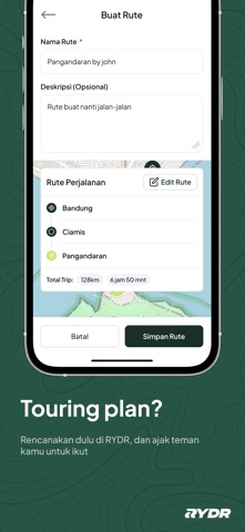
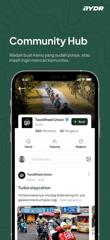

Icon palette
About this app
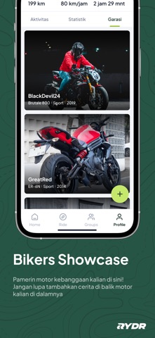
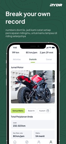
RYDR adalah platform buat kalian, para Motorcycle Enthusiast, untuk saling menyapa dan bertukar cerita. Kamu bisa sharing setiap perjalanan di sini, show off motor kesayangan, sampai pamerin achievement personal kamu lewat RYDR! Abadikan setiap perjalanan Dengan RYDR, kamu bisa rekam setiap momen perjalanan, mulai dari rute yang kamu lewati, titik saat kamu berhenti sejenak, sampai setiap foto yang kamu ambil di lokasi yang belum masuk dalam peta. Album Motormu Tunjukkan koleksi roda dua kalian di sini! Ceritakan setiap perjalanannya, perubahan kecil yang ada, modifikasi dan perubahan total, sampai detail piala yang sudah dimenangkan. Lampaui Dirimu Kami mengingat setiap jarak hingga waktu yang kamu berkendara. Lampaui rekormu di perjalanan selanjutnya! Bergabung dengan Komunitas Terkadang, bukan soal tujuan. Tapi soal teman dalam perjalanan. Temukan komunitas yang paling cocok untu…
App details
What you can learn from RYDR
Every shipping app on the App Store has gone through the same decisions you're working through right now: which screenshot goes first, what caption sits over it, which device frame to show, what color the background should be. The 10 screenshots above are RYDR's answers to those questions — they're public, they're real, and they made it through Apple's review.
What the numbers say: RYDR runs a mixed light-and-dark set where the background shifts from screenshot to screenshot (first shot #FCFCFC) — each image has to stand on its own, so the captions carry more of the story. The accent colour we picked up, #6C8454, is the one to reuse for badges, arrows and highlighted words if you borrow this look. Hit Use this style to open the editor with these exact colours and drop your own screenshot in.
Notice the first screenshot in particular. It's the one users see in search results and on the product page, and it's where most apps spend their best caption and tightest design. Look at the proportion of background to phone, where the text sits, what one thing the image is trying to communicate.
Want to see how other Navigation apps approach the same problem? Browse more Navigation apps in the showcase.
Take what works into your own screenshots
Open LaunchShots and design your App Store & Google Play screenshots — pick a device frame, drop captions, ship in minutes. Free, in your browser.
Open the screenshot editor →Apps with a similar look
Closest background + accent colours among the listings we've analysed — useful when you want to see the same palette handled by a different team.