Screenshot style breakdown
Sampled from 6 of Regnmätare: Följ regn's App Store screenshots — background, accent and theme, measured by LaunchShots (not something Apple publishes).
#DCE4FC bg
#C1C8DD
#546C04 accent
#111111 text
Screenshots



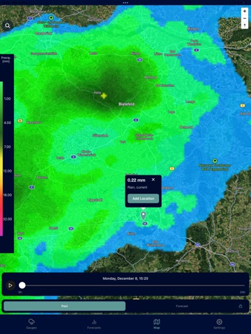
iPad screenshots

Icon palette
About this app
Regnmätare – Se exakt hur mycket regn som har fallit Få precisa nederbördsmängder för din plats. Oavsett om du sköter grödor, planerar arbete utomhus eller håller koll på trädgården ger Regnmätare dig tydliga och tillförlitliga mätningar utan krångel. --- Varför Användare Gillar Den --- Exakta nederbördsmängder som uppdateras under dagen Enkel, mätarinspirerad visning som är lätt att läsa vid en snabb blick Dagliga, veckovisa och månatliga sammanfattningar för bättre planering Stöd för flera platser: gårdar, fält, byggarbetsplatser eller hemmet Historik över nederbörd för mer välgrundade beslut Ingen distraktion och ingen konfiguration — bara tydliga regndata --- Perfekt För --- Lantbrukare som övervakar fält och bevattning Byggarbetsplatser som planerar säkert utomhusarbete Trädgårdsägare som följer markfuktighet Husägare som sköter gräsmatta och dräneringssystem Utomhusarbet…
App details
What you can learn from Regnmätare: Följ regn
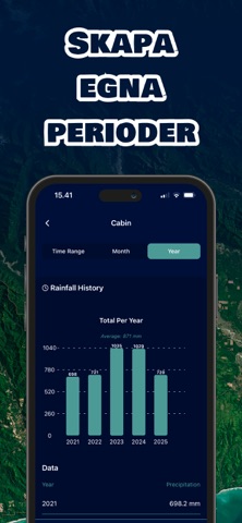
Every shipping app on the App Store has gone through the same decisions you're working through right now: which screenshot goes first, what caption sits over it, which device frame to show, what color the background should be. The 9 screenshots above are Regnmätare: Följ regn's answers to those questions — they're public, they're real, and they made it through Apple's review.
What the numbers say: Regnmätare: Följ regn runs a mixed light-and-dark set where the background shifts from screenshot to screenshot (first shot #DCE4FC) — each image has to stand on its own, so the captions carry more of the story. The accent colour we picked up, #546C04, is the one to reuse for badges, arrows and highlighted words if you borrow this look. Hit Use this style to open the editor with these exact colours and drop your own screenshot in.
Notice the first screenshot in particular. It's the one users see in search results and on the product page, and it's where most apps spend their best caption and tightest design. Look at the proportion of background to phone, where the text sits, what one thing the image is trying to communicate.
Want to see how other Weather apps approach the same problem? Browse more Weather apps in the showcase.
Take what works into your own screenshots
Open LaunchShots and design your App Store & Google Play screenshots — pick a device frame, drop captions, ship in minutes. Free, in your browser.
Open the screenshot editor →Apps with a similar look
Closest background + accent colours among the listings we've analysed — useful when you want to see the same palette handled by a different team.