Chart position — tracked daily by LaunchShots
Screenshot style breakdown
Sampled from 5 of Школьная карта НН's App Store screenshots — background, accent and theme, measured by LaunchShots (not something Apple publishes).
#CCE4FC bg
#B3C8DD
#3C9CFC accent
#111111 text
Screenshots


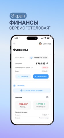

iPad screenshots


Icon palette
About this app
Приложение «Школьная карта НН» - быстрый способ получить всю информацию об учебном процессе вашего ребёнка в школах города Нижнего Новгорода в любое удобное время в вашем смартфоне. Приложение содержит модули «Электронная проходная» и «Электронная столовая», что позволяет родителям: - получать оповещения о входе и выходе ребенка из школы с помощью Push-уведомлений и E-mail; - следить за меню ребёнка, ограничивать лимит трат на питание в день, устанавливать запреты на конкретные продукты, аллергены; - просматривать меню школьной столовой с детализацией по каждому блюду и отзывами других родителей; - просматривать информацию по нескольким детям в пределах одной семьи в одной учетной записи; - просматривать историю начисления дотаций на льготное питание. Мы постоянно работаем над обновлением и улучшением нашего приложения. Если у вас возникли вопросы, пожелания или технические проблемы,…
App details
What you can learn from Школьная карта НН
Every shipping app on the App Store has gone through the same decisions you're working through right now: which screenshot goes first, what caption sits over it, which device frame to show, what color the background should be. The 10 screenshots above are Школьная карта НН's answers to those questions — they're public, they're real, and they made it through Apple's review.
What the numbers say: Школьная карта НН runs a light set where the background shifts from screenshot to screenshot (first shot #CCE4FC) — each image has to stand on its own, so the captions carry more of the story. The accent colour we picked up, #3C9CFC, is the one to reuse for badges, arrows and highlighted words if you borrow this look. Hit Use this style to open the editor with these exact colours and drop your own screenshot in.
Notice the first screenshot in particular. It's the one users see in search results and on the product page, and it's where most apps spend their best caption and tightest design. Look at the proportion of background to phone, where the text sits, what one thing the image is trying to communicate.
Want to see how other Education apps approach the same problem? Browse more Education apps in the showcase.
Take what works into your own screenshots
Open LaunchShots and design your App Store & Google Play screenshots — pick a device frame, drop captions, ship in minutes. Free, in your browser.
Open the screenshot editor →Apps with a similar look
Closest background + accent colours among the listings we've analysed — useful when you want to see the same palette handled by a different team.