Chart position — tracked daily by LaunchShots
Screenshot style breakdown
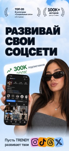
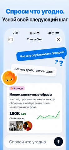
Sampled from 6 of Trendy: Аналитика Буст Профиля's App Store screenshots — background, accent and theme, measured by LaunchShots (not something Apple publishes).
#DCECFC bg
#C1CFDD
#B47454 accent
#111111 text
- #1BAM
- #2Спроси что угодно. Узнай свой следующий шаг M Trendy Chat X
- #3Смотри, что работает и делай больше такого «8 твоё недавнее видео
- #4Создавай контент за секунды 4% Карусель © Референс
- #5до того, как они взлетят < Создать пост
- #6Планируй контент чтобы быть впереди
Captions read from the screenshots (OCR, may contain small errors): 6 headlines, 7.3 words on average (longest 11).
Screenshots


Icon palette
About this app
От трендов до стратегии — всё, что нужно, в одном приложении Создавать контент сложно. Но быть последовательным не должно быть Trendy — это твой помощник на базе искусственного интеллекта для соцсетей. Он анализирует, планирует, оптимизирует и персонализирует стратегию роста, пока ты сосредоточен на творчестве Экономь более 10 часов в неделю Начни неделю с готовой контент-стратегии, сценариев для видео, идей для постов и аналитики. Просмотри, утверди и создай. Остальное сделает Trendy Умное планирование контента Хватит гадать, что публиковать. Trendy превращает твои идеи и тренды в чёткий контент-план, адаптированный под твой стиль, аудиторию и ритм. Это помощник, который учится с каждым постом Отзывы пользователей Наконец-то публикую стабильно и без выгорания Мой охват удвоился всего за две недели благодаря недельному плану Перестал переживать, что публиковать. Теперь профиль реал…
App details
What you can learn from Trendy: Аналитика Буст Профиля
Every shipping app on the App Store has gone through the same decisions you're working through right now: which screenshot goes first, what caption sits over it, which device frame to show, what color the background should be. The 6 screenshots above are Trendy: Аналитика Буст Профиля's answers to those questions — they're public, they're real, and they made it through Apple's review.
What the numbers say: Trendy: Аналитика Буст Профиля runs a light set where the background shifts from screenshot to screenshot (first shot #DCECFC) — each image has to stand on its own, so the captions carry more of the story. The accent colour we picked up, #B47454, is the one to reuse for badges, arrows and highlighted words if you borrow this look. Hit Use this style to open the editor with these exact colours and drop your own screenshot in.
Notice the first screenshot in particular. It's the one users see in search results and on the product page, and it's where most apps spend their best caption and tightest design. Look at the proportion of background to phone, where the text sits, what one thing the image is trying to communicate.
Want to see how other Social Networking apps approach the same problem? Browse more Social Networking apps in the showcase.
Take what works into your own screenshots
Open LaunchShots and design your App Store & Google Play screenshots — pick a device frame, drop captions, ship in minutes. Free, in your browser.
Open the screenshot editor →Apps with a similar look
Closest background + accent colours among the listings we've analysed — useful when you want to see the same palette handled by a different team.