Chart position — tracked daily by LaunchShots
Screenshot style breakdown
Sampled from 6 of ラブリン(LOVERIN)'s App Store screenshots — background, accent and theme, measured by LaunchShots (not something Apple publishes).
#FCFCFC bg
#DDDDDD
#FCC44C accent
#111111 text
Screenshots


Icon palette
About this app
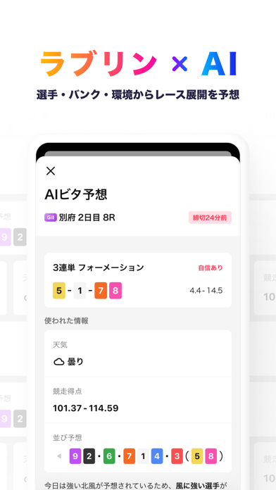
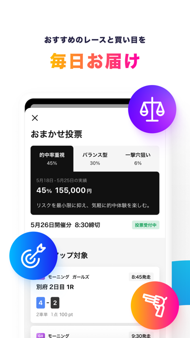
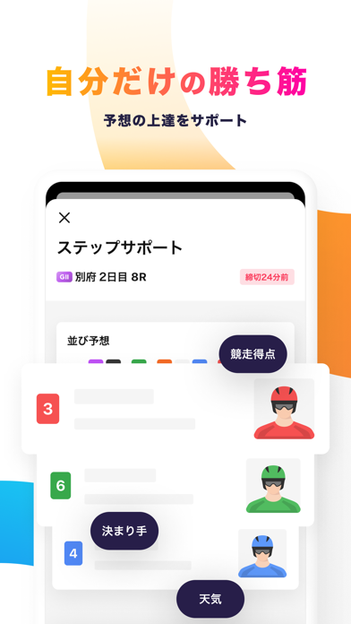
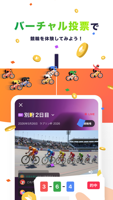
【ラブリンの特徴機能】 <まずは無料で投票体験> バーチャル投票で練習スタート。自分のお金を使わずに気軽に競輪を楽しめるので、ルールを覚えたい初心者の方や、新しい予想戦略を試したい時にも最適です。 <AIビタ予想で勝率アップ> 選手の実力やバンクの特徴、その日の環境からレース展開をAIが瞬時に予想!あなたにぴったりの組み合わせを提案してくれます。注目すべき指標のポイントも解説してくれるので、使えば使うほどあなたの予想スキルも磨かれていきます。 <おまかせ投票で車券を購入> 「どのレースが良いかわからない」という時でも、ラブリンが厳選したおすすめレースと買い目を毎日お届けするので、くじを引くような感覚で手軽に車券を購入できます。お気に入りのコースを見つけて毎日投票していれば、思いがけない的中や回収のチャンスが舞い込んでくるかもしれません。 <ステップサポートで自分好みの予想を> 気になる指標や、応援している「推し選手」の組み合わせを選ぶだけ!あなたのこだわりを反映したおすすめの買い目を、ラブリン…
App details
What you can learn from ラブリン(LOVERIN)
Every shipping app on the App Store has gone through the same decisions you're working through right now: which screenshot goes first, what caption sits over it, which device frame to show, what color the background should be. The 6 screenshots above are ラブリン(LOVERIN)'s answers to those questions — they're public, they're real, and they made it through Apple's review.
What the numbers say: ラブリン(LOVERIN) runs a light set with one background colour (#FCFCFC) carried across every screenshot — the listing reads as a single poster when the shots sit side by side in search results. The accent colour we picked up, #FCC44C, is the one to reuse for badges, arrows and highlighted words if you borrow this look. Hit Use this style to open the editor with these exact colours and drop your own screenshot in.
Notice the first screenshot in particular. It's the one users see in search results and on the product page, and it's where most apps spend their best caption and tightest design. Look at the proportion of background to phone, where the text sits, what one thing the image is trying to communicate.
Want to see how other Sports apps approach the same problem? Browse more Sports apps in the showcase.
Take what works into your own screenshots
Open LaunchShots and design your App Store & Google Play screenshots — pick a device frame, drop captions, ship in minutes. Free, in your browser.
Open the screenshot editor →Apps with a similar look
Closest background + accent colours among the listings we've analysed — useful when you want to see the same palette handled by a different team.