Chart position — tracked daily by LaunchShots
Screenshot changes — detected by LaunchShots
Screenshot style breakdown
Sampled from 6 of Blume: осознанные знакомства's App Store screenshots — background, accent and theme, measured by LaunchShots (not something Apple publishes).
#140C0C bg
#342E2E
#FC9484 accent
#FFFFFF text
Screenshots





Icon palette
About this app
Устали от бесконечных свайпов, пустых анкет и диалогов ни о чём? Blume — место, где знакомства начинаются правильно: со взаимного уважения, честности и желания узнать друг друга по-настоящему. Здесь не получится ставить лайки просто так, ведь каждый чат может стать началом чего-то важного. Мы помогаем не только найти своего человека, но и разобраться в себе, понять свои цели и создать прочную основу для отношений. Это пространство для знакомства зрелых людей, готовых к глубоким эмоциональным связям. Никаких свайпов Вместо этого внимательно изучайте каждый профиль и ставьте лайки тем, кто вас зацепил — пусть знакомства начнутся не с мимолётной симпатии, а с понимания, что вы действительно друг другу подходите. Подробные профили У вас есть возможность узнать человека по-настоящему: его ценности, цели, образ жизни и ожидания от партнёра. Сервис поможет заполнить профиль, даже если не …
App details
What you can learn from Blume: осознанные знакомства
Every shipping app on the App Store has gone through the same decisions you're working through right now: which screenshot goes first, what caption sits over it, which device frame to show, what color the background should be. The 8 screenshots above are Blume: осознанные знакомства's answers to those questions — they're public, they're real, and they made it through Apple's review.
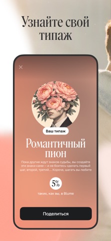
What the numbers say: Blume: осознанные знакомства runs a mixed light-and-dark set where the background shifts from screenshot to screenshot (first shot #140C0C) — each image has to stand on its own, so the captions carry more of the story. The accent colour we picked up, #FC9484, is the one to reuse for badges, arrows and highlighted words if you borrow this look. Hit Use this style to open the editor with these exact colours and drop your own screenshot in.
Notice the first screenshot in particular. It's the one users see in search results and on the product page, and it's where most apps spend their best caption and tightest design. Look at the proportion of background to phone, where the text sits, what one thing the image is trying to communicate.
Want to see how other Social Networking apps approach the same problem? Browse more Social Networking apps in the showcase.
Take what works into your own screenshots
Open LaunchShots and design your App Store & Google Play screenshots — pick a device frame, drop captions, ship in minutes. Free, in your browser.
Open the screenshot editor →Apps with a similar look
Closest background + accent colours among the listings we've analysed — useful when you want to see the same palette handled by a different team.