Chart position — tracked daily by LaunchShots
Screenshot style breakdown
Sampled from 6 of ARES: THE IRON VANGUARD's App Store screenshots — background, accent and theme, measured by LaunchShots (not something Apple publishes).
#040404 bg
#272727
#5C2C1C accent
#FFFFFF text
Screenshots


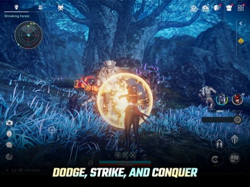
iPad screenshots




Icon palette
About this app
Official Discord link: https://discord.gg/yHUYPKRFU4 Global Launch Enjoy special events celebrating our global launch and grab exclusive rewards! Join before the gates to a new battlefield open. Be among the first to prepare for ARES : THE IRON VANGUARD’s first deployment. Suit Up & Change the Flow of Battle. Two combat styles to seamlessly switch between in freeflowing combat. A next-level stylish action RPG. ▣ Game Introduction ▣ ■ Suit-Switching: Change the Flow of Battle ■ Switch between two suits in real time. Combine weapons and skills to create your own combat style. Single-handedly turn the tide of war, and dominate hordes of enemies in style. ■ Wield Multiple Classes in Combat ■ The Engineer: fight with heavy gauntlets and deploy drone assaults. The Warlock: unleash AoE magic powered by cosmic energy. The Warlord: brave the front lines with a massive rocket-hammer and …
App details
What you can learn from ARES: THE IRON VANGUARD
Every shipping app on the App Store has gone through the same decisions you're working through right now: which screenshot goes first, what caption sits over it, which device frame to show, what color the background should be. The 14 screenshots above are ARES: THE IRON VANGUARD's answers to those questions — they're public, they're real, and they made it through Apple's review.
What the numbers say: ARES: THE IRON VANGUARD runs a dark set with one background colour (#040404) carried across every screenshot — the listing reads as a single poster when the shots sit side by side in search results. The accent colour we picked up, #5C2C1C, is the one to reuse for badges, arrows and highlighted words if you borrow this look. Hit Use this style to open the editor with these exact colours and drop your own screenshot in.
Notice the first screenshot in particular. It's the one users see in search results and on the product page, and it's where most apps spend their best caption and tightest design. Look at the proportion of background to phone, where the text sits, what one thing the image is trying to communicate.
Want to see how other Games apps approach the same problem? Browse more Games apps in the showcase.
Take what works into your own screenshots
Open LaunchShots and design your App Store & Google Play screenshots — pick a device frame, drop captions, ship in minutes. Free, in your browser.
Open the screenshot editor →Apps with a similar look
Closest background + accent colours among the listings we've analysed — useful when you want to see the same palette handled by a different team.