Screenshot changes — detected by LaunchShots
Screenshot style breakdown
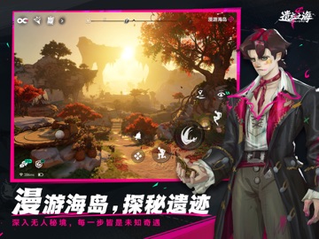
Sampled from 6 of 遗忘之海's App Store screenshots — background, accent and theme, measured by LaunchShots (not something Apple publishes).
#240C34 bg
#422E50
#5C2484 accent
#FFFFFF text
Screenshots


iPad screenshots



Icon palette
About this app
听着,我的船长。 在别的地儿,你忙着拯救世界、扬名立万。可在这儿?除了搜刮大海上的金银财宝以外,你还要把丢了的“脑子”找回来。 你并不孤单,你的伙伴、那个叫艾丝的机灵鬼,自称天才冒险家。但她口袋里除了一些只会爆炸的奇怪发明,也没比你强多少。因为她跟你一样,也是个把过去忘了个精光的倒霉蛋——显然她自己并不这么想。 总之,欢迎你来到《遗忘之海》! 想要自由?这片大海就没有“规则”这俩字! 想当航海王?还在等什么?去把每一个你看不爽的家伙打飞!掌好船舵出发,这里的每一处海域、每一座岛,都等着你去探索!尽情搜刮藏在大海上的宝藏,再回到奥托皮亚挥霍个痛快吧! 想要船员?这里才华横溢的怪人可太多了! 这片海上多得是跟你和艾丝一样古怪但有实力的家伙:从梦中获取灵感的裁缝、曾是传奇海盗的颓废懒鬼、叛出贵族世家的军舰长官……先试试看和他们相处吧,至于是和他们成为伙伴,还是被他们扔到海里喂鱼,谁知道呢! 想要战斗?快亮出你全副武装的战船! 探索广袤的岛屿,记得带上最靠谱的伙伴组成小队迎击敌人。招惹海上的巨怪,就得亮出船…
App details
What you can learn from 遗忘之海
Every shipping app on the App Store has gone through the same decisions you're working through right now: which screenshot goes first, what caption sits over it, which device frame to show, what color the background should be. The 12 screenshots above are 遗忘之海's answers to those questions — they're public, they're real, and they made it through Apple's review.
What the numbers say: 遗忘之海 runs a dark set with one background colour (#240C34) carried across every screenshot — the listing reads as a single poster when the shots sit side by side in search results. The accent colour we picked up, #5C2484, is the one to reuse for badges, arrows and highlighted words if you borrow this look. Hit Use this style to open the editor with these exact colours and drop your own screenshot in.
Notice the first screenshot in particular. It's the one users see in search results and on the product page, and it's where most apps spend their best caption and tightest design. Look at the proportion of background to phone, where the text sits, what one thing the image is trying to communicate.
Want to see how other Games apps approach the same problem? Browse more Games apps in the showcase.
Take what works into your own screenshots
Open LaunchShots and design your App Store & Google Play screenshots — pick a device frame, drop captions, ship in minutes. Free, in your browser.
Open the screenshot editor →Apps with a similar look
Closest background + accent colours among the listings we've analysed — useful when you want to see the same palette handled by a different team.