Screenshot changes — detected by LaunchShots
Screenshot style breakdown
Sampled from 6 of SUT Kontrol's App Store screenshots — background, accent and theme, measured by LaunchShots (not something Apple publishes).
#0C8CCC bg
#2E9CD3
#243454 accent
#FFFFFF text
Screenshots

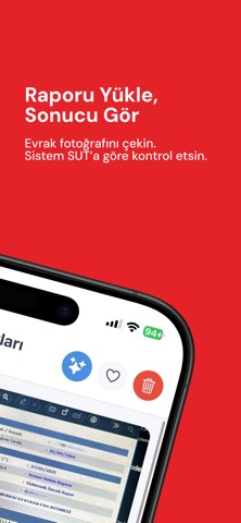


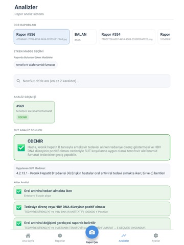
iPad screenshots



Icon palette
About this app
SUT Kontrol, eczacılar ve eczane ekipleri için geliştirilmiş yapay zeka destekli bir rapor analiz uygulamasıdır. Hasta raporlarını kamera ile çekebilir veya galeriden yükleyerek SUT değerlendirme sürecinizi daha hızlı ve düzenli hale getirebilirsiniz. ÖNE ÇIKAN ÖZELLİKLER Akıllı Rapor Analizi -Hasta raporunu kamera ile fotoğraflayın veya galeriden seçin -OCR destekli metin okuma ile rapor içeriğini analiz edin -Etken madde ve SGK kodu bazlı değerlendirme adımlarına hızlıca ilerleyin -Analiz sonucunu detaylı açıklamalarla görüntüleyin Rapor ve Analiz Yönetimi -Analiz edilen raporları tek ekranda görüntüleyin -Geçmiş rapor detaylarına ve analiz kayıtlarına erişin -Rapor durumlarını takip edin ve kayıtlar arasında arama yapın Destekleyici Kontrol Araçları -Gerektiğinde endikasyon dışı izin belgesi (EDI) ekleyin -Etken madde otomatik bulunamadığında SGK kodu ile arama yapın -Analiz a…
App details
What you can learn from SUT Kontrol
Every shipping app on the App Store has gone through the same decisions you're working through right now: which screenshot goes first, what caption sits over it, which device frame to show, what color the background should be. The 14 screenshots above are SUT Kontrol's answers to those questions — they're public, they're real, and they made it through Apple's review.
What the numbers say: SUT Kontrol runs a dark set where the background shifts from screenshot to screenshot (first shot #0C8CCC) — each image has to stand on its own, so the captions carry more of the story. The accent colour we picked up, #243454, is the one to reuse for badges, arrows and highlighted words if you borrow this look. Hit Use this style to open the editor with these exact colours and drop your own screenshot in.
Notice the first screenshot in particular. It's the one users see in search results and on the product page, and it's where most apps spend their best caption and tightest design. Look at the proportion of background to phone, where the text sits, what one thing the image is trying to communicate.
Want to see how other Medical apps approach the same problem? Browse more Medical apps in the showcase.
Take what works into your own screenshots
Open LaunchShots and design your App Store & Google Play screenshots — pick a device frame, drop captions, ship in minutes. Free, in your browser.
Open the screenshot editor →Apps with a similar look
Closest background + accent colours among the listings we've analysed — useful when you want to see the same palette handled by a different team.