Screenshot style breakdown
Sampled from 6 of スタンプ@狸(たぬき)の子's App Store screenshots — background, accent and theme, measured by LaunchShots (not something Apple publishes).
#FCFCFC bg
#DDDDDD
#DCAC7C accent
#111111 text
Screenshots


Icon palette
About this app
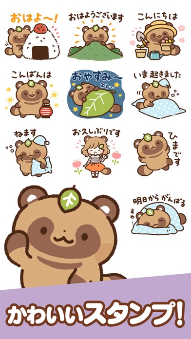
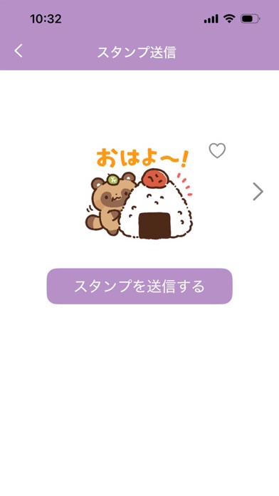
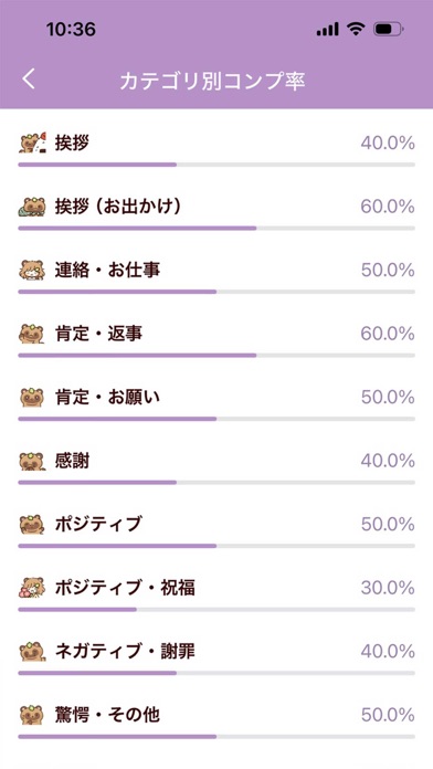
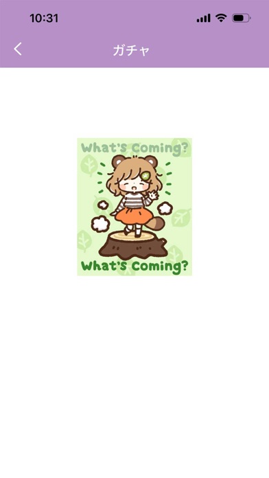
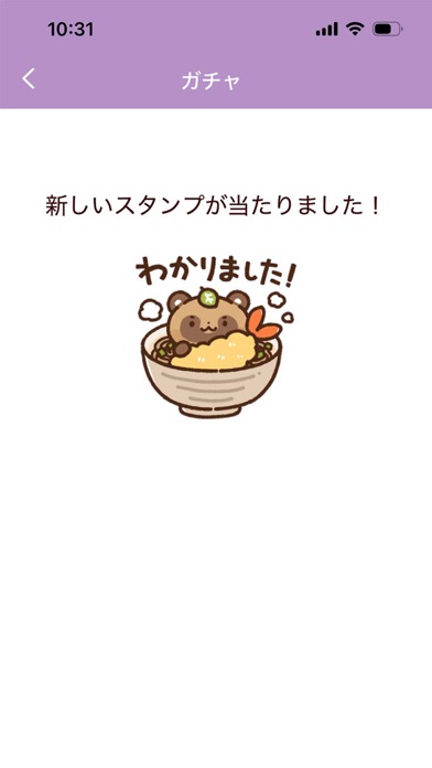
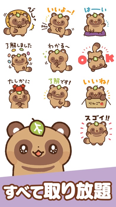
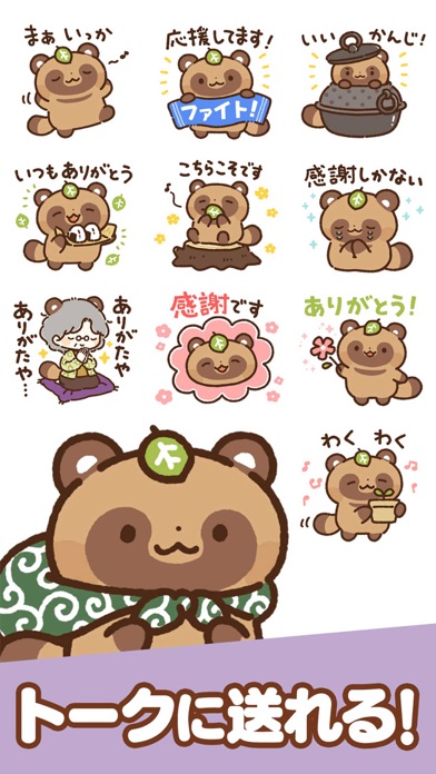
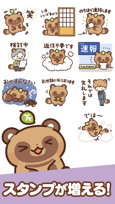
かわいい「たぬきの子」が登場する、無料スタンプアプリです。 本アプリのテーマは「柔軟な適応力」。 コンセプトとなる“タヌキ”は、昔話では「化ける」「人をだます」存在として描かれることが多い一方で、実は“人の行動や言葉をよく観察して理解する”コミュニケーション上手な動物として親しまれてきました。 そんなタヌキの魅力を、スタンプとアニメーションで楽しく表現しています。 ■ 登録不要ですぐ使える アプリを開いてすぐにスタンプを送信できます。 通信でスタンプを読み込む必要がなく、アプリならではの快適さをそのまま体験できます。 ■ SNSやトークアプリに簡単送信 各種SNSやトークルームへ、ワンタップでスタンプを送信できます。 日常のやり取りを、たぬきの子がかわいく盛り上げます。 ■ 集めて楽しい“スタンプコレクション” アプリ内では、利用できるスタンプを集めていくコレクション要素を楽しめます。 テーマに沿ったアニメーションを多数実装したガチャなど、エンタメ性の高いギミックも満載。 ユニークなたぬきスタンプをぜひ集めてくだ…
App details
What you can learn from スタンプ@狸(たぬき)の子
Every shipping app on the App Store has gone through the same decisions you're working through right now: which screenshot goes first, what caption sits over it, which device frame to show, what color the background should be. The 10 screenshots above are スタンプ@狸(たぬき)の子's answers to those questions — they're public, they're real, and they made it through Apple's review.
What the numbers say: スタンプ@狸(たぬき)の子 runs a light set with one background colour (#FCFCFC) carried across every screenshot — the listing reads as a single poster when the shots sit side by side in search results. The accent colour we picked up, #DCAC7C, is the one to reuse for badges, arrows and highlighted words if you borrow this look. Hit Use this style to open the editor with these exact colours and drop your own screenshot in.
Notice the first screenshot in particular. It's the one users see in search results and on the product page, and it's where most apps spend their best caption and tightest design. Look at the proportion of background to phone, where the text sits, what one thing the image is trying to communicate.
Want to see how other Entertainment apps approach the same problem? Browse more Entertainment apps in the showcase.
Take what works into your own screenshots
Open LaunchShots and design your App Store & Google Play screenshots — pick a device frame, drop captions, ship in minutes. Free, in your browser.
Open the screenshot editor →Apps with a similar look
Closest background + accent colours among the listings we've analysed — useful when you want to see the same palette handled by a different team.