Screenshot changes — detected by LaunchShots
Screenshot style breakdown
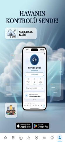
Sampled from 5 of Havanın Elçisi's App Store screenshots — background, accent and theme, measured by LaunchShots (not something Apple publishes).
#FCFCFC bg
#DDDDDD
#4C647C accent
#111111 text
- #1(Tümü © > — BÖLGE VE MAHALLE 8 ® A © °
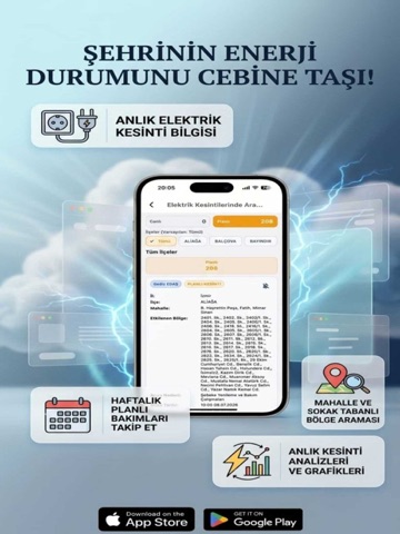
- #3HAFTALIK Zal MAHALLE VE 00000 BAKIMLARI ~~ Fs BÖLGE ARAMASI ANALİZLERİ
- #5Tümü, İLÇE BAZLI eld) KOLAY ARAMA
Captions read from the screenshots (OCR, may contain small errors): 3 headlines, 9.7 words on average (longest 12).
Screenshots



iPad screenshots



Icon palette
About this app
Günlük hayatınızı planlarken ihtiyaç duyacağınız tüm temel bilgiler artık tek bir yerde! Bu uygulama; güncel hava durumu raporları, nöbetçi eczane listeleri, baraj doluluk oranları ve planlı su kesintisi duyuruları gibi kritik verilere en hızlı şekilde ulaşmanızı sağlar. Özellikler: Anlık Bilgi Akışı: Hava durumu tahminlerinden altyapı duyurularına kadar yaşamınızı etkileyen verilere anında erişin. Kişiselleştirilmiş Kaydedilenler: Önemli gördüğünüz duyuruları veya ihtiyacınız olan nöbetçi eczane bilgilerini kaydedin. Kaydettiğiniz içeriklere, size özel ayrılmış olan "Kaydedilenler" sayfası üzerinden kolayca ulaşabilirsiniz. Gizlilik Odaklı Deneyim: Uygulamayı kullanmak için profil oluşturmanıza veya hesap açmanıza gerek yoktur. Kaydettiğiniz tüm veriler sadece kendi cihazınızda yerel olarak saklanır. Modern ve Sade Arayüz: Karmaşadan uzak tasarımıyla, aradığınız bilgiye en az doku…
App details
What you can learn from Havanın Elçisi
Every shipping app on the App Store has gone through the same decisions you're working through right now: which screenshot goes first, what caption sits over it, which device frame to show, what color the background should be. The 10 screenshots above are Havanın Elçisi's answers to those questions — they're public, they're real, and they made it through Apple's review.
What the numbers say: Havanın Elçisi runs a light set where the background shifts from screenshot to screenshot (first shot #FCFCFC) — each image has to stand on its own, so the captions carry more of the story. The accent colour we picked up, #4C647C, is the one to reuse for badges, arrows and highlighted words if you borrow this look. Hit Use this style to open the editor with these exact colours and drop your own screenshot in.
Notice the first screenshot in particular. It's the one users see in search results and on the product page, and it's where most apps spend their best caption and tightest design. Look at the proportion of background to phone, where the text sits, what one thing the image is trying to communicate.
Want to see how other Social Networking apps approach the same problem? Browse more Social Networking apps in the showcase.
Take what works into your own screenshots
Open LaunchShots and design your App Store & Google Play screenshots — pick a device frame, drop captions, ship in minutes. Free, in your browser.
Open the screenshot editor →Apps with a similar look
Closest background + accent colours among the listings we've analysed — useful when you want to see the same palette handled by a different team.