Screenshot changes — detected by LaunchShots
Screenshot style breakdown
Sampled from 4 of Kakkok's App Store screenshots — background, accent and theme, measured by LaunchShots (not something Apple publishes).
#FC947C bg
#DD826D
#CC1C1C accent
#111111 text
Reading the caption text from the screenshots in your browser…
Screenshots
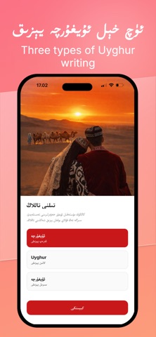
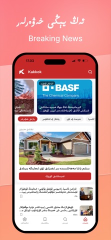
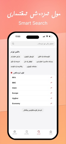

iPad screenshots


Icon palette
About this app
كاككۇك خەۋەرلىرى — دۇنيادىكى ئۇيغۇرلار ئۈچۈن مەخسۇس لايىھەلەنگەن ئۇچۇر سۇپىسى. دۇنيانىڭ قەيىرىدە بولۇڭ، كاككۇك سىزنى ئەڭ يېڭى ۋە ئەڭ مۇھىم ئۇچۇرلار بىلەن تەمىنلەيدۇ. بىز پەقەت بىر خەۋەر ئەپىلا ئەمەس، بەلكى چەتئەلدىكى ئۇيغۇرلارنىڭ تۇرمۇش، مائارىپ ۋە سىياسىي ئېھتىياجىنى قاندۇرۇش ئۈچۈن قۇرۇلغان بىر ئۇچۇر مەركىزى. ئاساسلىق ئالاھىدىلىكلىرى: دۆلەت بويىچە خەۋەرلەر: سىز تۇرۇۋاتقان دۆلەت (تۈركىيە، قازاقىستان، ئۆزبېكىستان، ياۋروپا ۋە ئامېرىكا قاتارلىق) ۋە رايونلارغا ئاساسەن تۈرگە ئايرىلغان مۇھىم خەۋەرلەرنى تېز سۈرئەتتە يەتكۈزىدۇ. كۆپ خىللاشقان مەزمۇنلار: سىياسەت، ئىقتىساد، مائارىپ (ئوقۇ-ئوقۇتۇش)، مەدەنىيەت ۋە تېخنىكا ساھەسىدىكى ئەڭ يېڭى يۈزلىنىشلەرنى قاپلايدۇ. سۈنئىي ئىدراك ياردىمى: ئالدىنقى قاتاردىكى سۈنئىي ئىدراك (AI) تېخنىكىسى ئارقىلىق، دۇنيادىكى مۇھىم خەۋەر مەنبەلىرىدىن ئۇچۇرلارنى سىكاننېرلايدۇ ۋە ئۇيغۇر تىلىدا سىزگە تەقدىم قىلىدۇ. تېز ۋە قولايلىق: ئاددىي، پاكىز ۋە تېز مەشغۇلات سىستېمىس…
App details
What you can learn from Kakkok
Every shipping app on the App Store has gone through the same decisions you're working through right now: which screenshot goes first, what caption sits over it, which device frame to show, what color the background should be. The 8 screenshots above are Kakkok's answers to those questions — they're public, they're real, and they made it through Apple's review.
What the numbers say: Kakkok runs a light set with one background colour (#FC947C) carried across every screenshot — the listing reads as a single poster when the shots sit side by side in search results. The accent colour we picked up, #CC1C1C, is the one to reuse for badges, arrows and highlighted words if you borrow this look. Hit Use this style to open the editor with these exact colours and drop your own screenshot in.
Notice the first screenshot in particular. It's the one users see in search results and on the product page, and it's where most apps spend their best caption and tightest design. Look at the proportion of background to phone, where the text sits, what one thing the image is trying to communicate.
Want to see how other News apps approach the same problem? Browse more News apps in the showcase.
Take what works into your own screenshots
Open LaunchShots and design your App Store & Google Play screenshots — pick a device frame, drop captions, ship in minutes. Free, in your browser.
Open the screenshot editor →Apps with a similar look
Closest background + accent colours among the listings we've analysed — useful when you want to see the same palette handled by a different team.