Screenshot changes — detected by LaunchShots
Screenshot style breakdown
Sampled from 3 of NEOLYMP Fitness's App Store screenshots — background, accent and theme, measured by LaunchShots (not something Apple publishes).
#141414 bg
#343434
#5C947C accent
#FFFFFF text
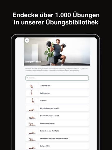
- #2Endecke über 1.000 Ubungen in unserer Ubungsbibliothek
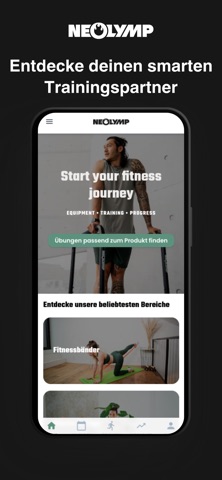
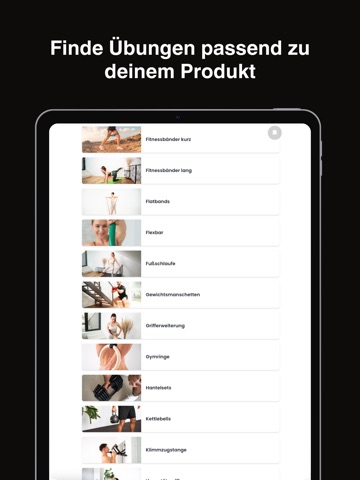
- #3Finde Ubungen passend zu deinem Produkt
Captions read from the screenshots (OCR, may contain small errors): 2 headlines, 6.5 words on average (longest 7).
Screenshots


iPad screenshots
Icon palette
About this app
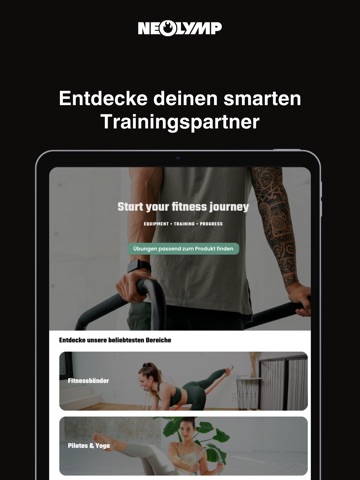
Mit der NEOLYMP App hast du deinen smarten Trainingspartner immer dabei – abgestimmt auf deine NEOLYMP Produkte und deine Ziele. Statt langem Suchen bekommst du genau die Übungen, die zu deinem Equipment passen: aus einer Bibliothek mit über 1000 Übungen inklusive verständlicher Beschreibungen und passenden Varianten. Zusätzlich stehen dir zahlreiche Workouts kostenlos zur Verfügung, damit du sofort loslegen kannst, egal ob du gerade erst startest oder schon fortgeschritten trainierst. Du willst gezielt Beine, Core oder Oberkörper trainieren, Kraft aufbauen, beweglicher werden oder einfach regelmäßig in Bewegung bleiben? Mit smarten Filtern findest du in Sekunden die richtigen Übungen und stellst dir daraus deinen persönlichen Trainingsplan zusammen. Damit Training wirklich im Alltag funktioniert, unterstützt dich die App auch beim Dranbleiben: Plane deine Einheiten über die Kalenderf…
App details
What you can learn from NEOLYMP Fitness
Every shipping app on the App Store has gone through the same decisions you're working through right now: which screenshot goes first, what caption sits over it, which device frame to show, what color the background should be. The 6 screenshots above are NEOLYMP Fitness's answers to those questions — they're public, they're real, and they made it through Apple's review.
What the numbers say: NEOLYMP Fitness runs a dark set with one background colour (#141414) carried across every screenshot — the listing reads as a single poster when the shots sit side by side in search results. The accent colour we picked up, #5C947C, is the one to reuse for badges, arrows and highlighted words if you borrow this look. Hit Use this style to open the editor with these exact colours and drop your own screenshot in.
Notice the first screenshot in particular. It's the one users see in search results and on the product page, and it's where most apps spend their best caption and tightest design. Look at the proportion of background to phone, where the text sits, what one thing the image is trying to communicate.
Want to see how other Sports apps approach the same problem? Browse more Sports apps in the showcase.
Take what works into your own screenshots
Open LaunchShots and design your App Store & Google Play screenshots — pick a device frame, drop captions, ship in minutes. Free, in your browser.
Open the screenshot editor →Apps with a similar look
Closest background + accent colours among the listings we've analysed — useful when you want to see the same palette handled by a different team.