Screenshot changes — detected by LaunchShots
Screenshot style breakdown
Sampled from 6 of KPSS 2027 Soru Bankası & Test's App Store screenshots — background, accent and theme, measured by LaunchShots (not something Apple publishes).
#8464F4 bg
#9579F5
#64549C accent
#FFFFFF text
Screenshots


Icon palette
About this app
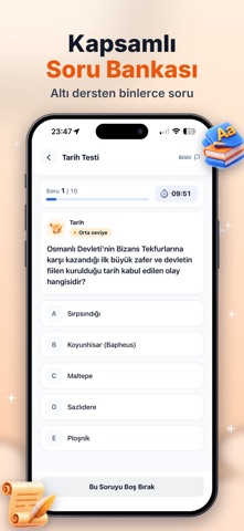
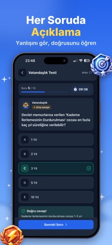
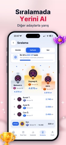
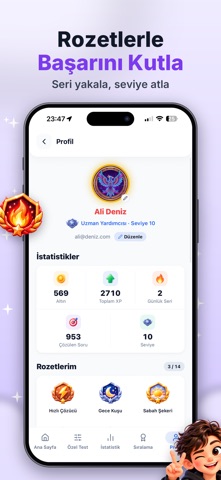
KPSS 2027'ye hazırlık artık cebinde. KPSS Mini Test yalnızca soru çözdürmez: neyi neden yanlış yaptığını gösterir, hatalarını tekrar ettirir ve seni sınava kadar planlı tutar. ÖNE ÇIKAN ÖZELLİKLER - ANINDA AÇIKLAMA Her sorudan sonra doğru cevabı ve nedenini hemen gör. Yanlışta takılı kalma, oracıkta öğren. - PARAGRAF SORULARI Türkçe'de paragraf soruları ayrı bir kartta, rahat okunacak şekilde gelir. Paragraflı sorulara ek süre verilir. - YANLIŞLARINI TEKRAR ET Hatalı yaptığın sorular otomatik toplanır. "Yanlışların" bölümünden hepsini öğrenene kadar tekrar çöz. - TAHMİNİ NET VE HEDEF Çözdüğün sorulara göre tahmini KPSS netini gör, hedef netini belirle, hangi dersin sana en çok net kazandıracağını öğren. - HAFTALIK ÇALIŞMA PLANI Zayıf konularına ve yanlışlarına göre hangi gün ne çalışacağın hazır. Dağınık değil, planlı çalış. - GÜNLÜK DENEME VE BOSS FIGHT Her gün yeni bir deneme v…
App details
What you can learn from KPSS 2027 Soru Bankası & Test
Every shipping app on the App Store has gone through the same decisions you're working through right now: which screenshot goes first, what caption sits over it, which device frame to show, what color the background should be. The 7 screenshots above are KPSS 2027 Soru Bankası & Test's answers to those questions — they're public, they're real, and they made it through Apple's review.
What the numbers say: KPSS 2027 Soru Bankası & Test runs a mixed light-and-dark set where the background shifts from screenshot to screenshot (first shot #8464F4) — each image has to stand on its own, so the captions carry more of the story. The accent colour we picked up, #64549C, is the one to reuse for badges, arrows and highlighted words if you borrow this look. Hit Use this style to open the editor with these exact colours and drop your own screenshot in.
Notice the first screenshot in particular. It's the one users see in search results and on the product page, and it's where most apps spend their best caption and tightest design. Look at the proportion of background to phone, where the text sits, what one thing the image is trying to communicate.
Want to see how other Education apps approach the same problem? Browse more Education apps in the showcase.
Take what works into your own screenshots
Open LaunchShots and design your App Store & Google Play screenshots — pick a device frame, drop captions, ship in minutes. Free, in your browser.
Open the screenshot editor →Apps with a similar look
Closest background + accent colours among the listings we've analysed — useful when you want to see the same palette handled by a different team.