Chart position — tracked daily by LaunchShots
Screenshot changes — detected by LaunchShots
Screenshot style breakdown
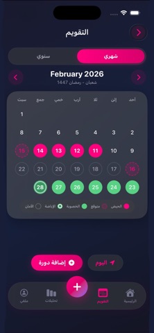
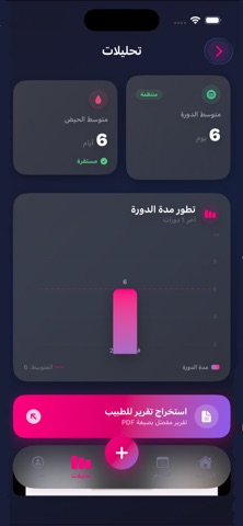
Sampled from 5 of حاسبة الدورة الشهرية الذكية's App Store screenshots — background, accent and theme, measured by LaunchShots (not something Apple publishes).
#1C1C3C bg
#3B3B57
#E40474 accent
#FFFFFF text
Screenshots



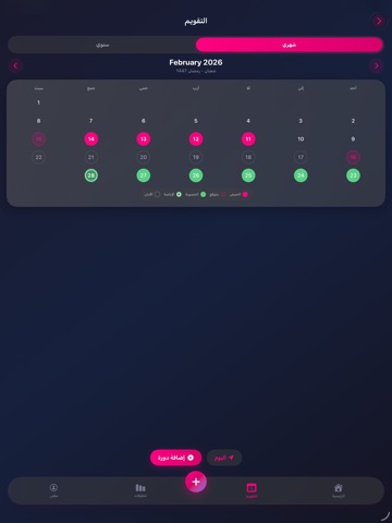
iPad screenshots




Icon palette
About this app
حاسبة الدورة الذكية: رفيقكِ الصحي المتكامل هل تبحثين عن تطبيق يفهم جسمكِ ويحترم خصوصيتكِ ؟ اكتشفي "حاسبة الدورة الذكية"، التطبيق العربي المتطور الذي يجمع بين الذكاء الاصطناعي في التنبؤ، الأناقة في التصميم، والخصوصية المطلقة. صُمم التطبيق ليكون ملاذكِ الصحي الهادئ، بعيداً عن التعقيدات، مع واجهة "سينمائية" مريحة للعين باللونين الكحلي والوردي الجذابين. لماذا تختارين "حاسبة الدورة الذكية"؟ تتبع ذكي وتوقعات دقيقة (حتى للدورة الحالية!): لا يكتفي التطبيق بتتبع الأيام الماضية، بل يتوقع "ذيل" دورتكِ الحالية بناءً على إعداداتكِ الشخصية، ويظهرها بدوائر أنيقة مقطعة لتخططي ليومكِ القادم بكل ثقة. وضع الحمل (Pregnancy Mode): ميزة جديدة كلياً تتيح لكِ تحويل التطبيق لمتابعة رحلة الحمل، مع واجهة مخصصة تتماشى مع هذه المرحلة الاستثنائية. تقارير طبية احترافية (PDF): يمكنكِ الآن استخراج تقرير شامل ومنظم باللغة العربية لمشاركته مع طبيبكِ، يتضمن متوسطات دورتكِ وسجل أعراضكِ بتنسيق طبي واضح. موسوعة صحتي الذ…
App details
What you can learn from حاسبة الدورة الشهرية الذكية
Every shipping app on the App Store has gone through the same decisions you're working through right now: which screenshot goes first, what caption sits over it, which device frame to show, what color the background should be. The 10 screenshots above are حاسبة الدورة الشهرية الذكية's answers to those questions — they're public, they're real, and they made it through Apple's review.
What the numbers say: حاسبة الدورة الشهرية الذكية runs a dark set with one background colour (#1C1C3C) carried across every screenshot — the listing reads as a single poster when the shots sit side by side in search results. The accent colour we picked up, #E40474, is the one to reuse for badges, arrows and highlighted words if you borrow this look. Hit Use this style to open the editor with these exact colours and drop your own screenshot in.
Notice the first screenshot in particular. It's the one users see in search results and on the product page, and it's where most apps spend their best caption and tightest design. Look at the proportion of background to phone, where the text sits, what one thing the image is trying to communicate.
Want to see how other Health & Fitness apps approach the same problem? Browse more Health & Fitness apps in the showcase.
Take what works into your own screenshots
Open LaunchShots and design your App Store & Google Play screenshots — pick a device frame, drop captions, ship in minutes. Free, in your browser.
Open the screenshot editor →Apps with a similar look
Closest background + accent colours among the listings we've analysed — useful when you want to see the same palette handled by a different team.