Chart position — tracked daily by LaunchShots
Screenshot style breakdown
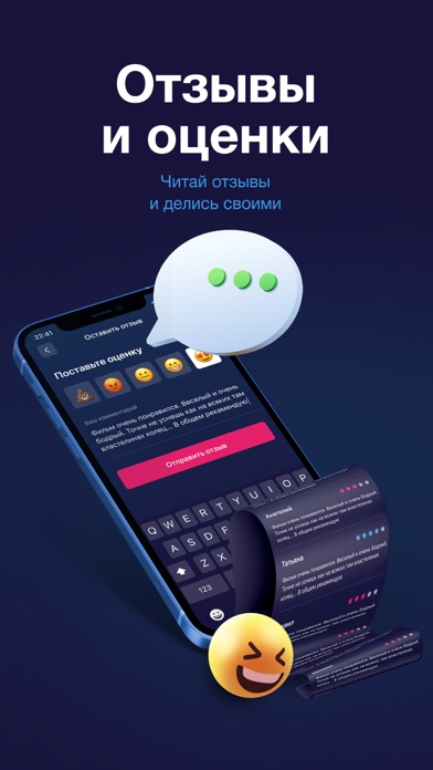
Sampled from 6 of Мягкий кинотеатр's App Store screenshots — background, accent and theme, measured by LaunchShots (not something Apple publishes).
#1C143C bg
#3B3457
#EC1464 accent
#FFFFFF text
Screenshots

Icon palette
About this app
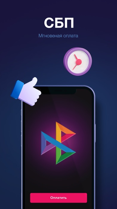
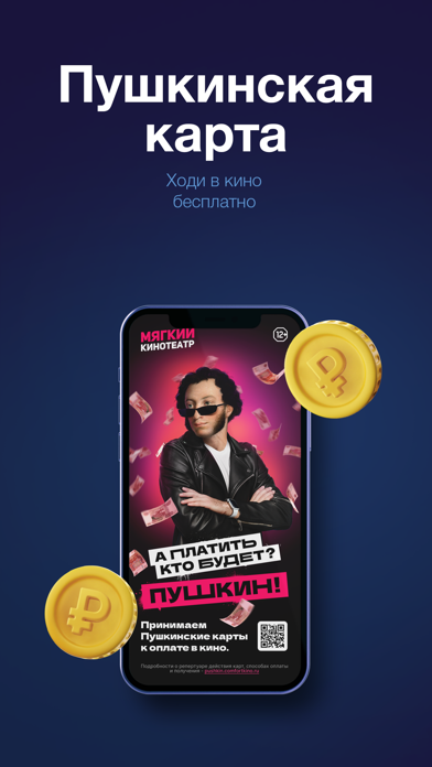
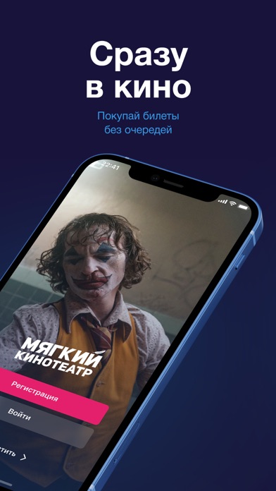
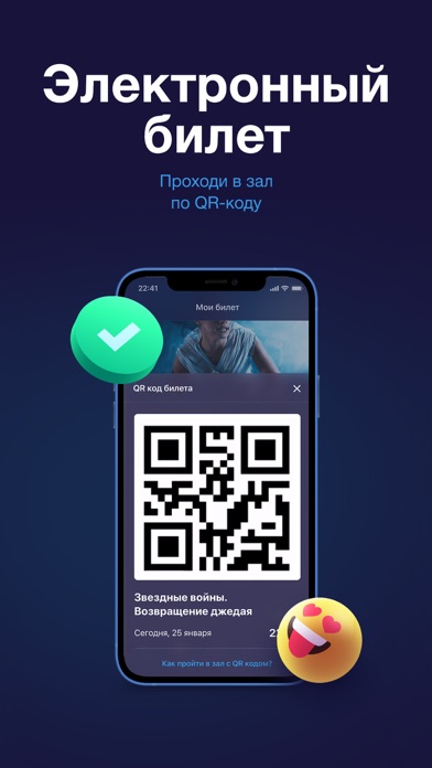
С приложением Мягкий кинотеатр вы можете: - зарабатывать и тратить кинобонусы - быстро и удобно покупать электронные билеты - пройти в зал по QR-коду - подписаться на новинки кино и первыми узнавать о выходе фильма в прокат - получать эксклюзивные предложения - оставлять свои отзывы и читать отзывы зрителей Спасибо, что вы с нами и оставляете отзывы, с каждой новой версией мы становимся лучше! Сеть Мягких кинотеатров в России: Мегаполис, г.Челябинск, Свердловский пр. 51а Алмаз, г.Челябинск, Копейское шоссе 64 Фокус, г.Челябинск, Молдавская 16 Отрада, г.Москва, 7-й км Пятницкого шоссе, владение 2 Гудок, г.Самара, Красноармейская 131 Космопорт, г.Самара, Дыбенко 30 Мегаполис, г.Уфа, Менделеева 137 Семейный парк, г.Магнитогорск, пр-т к.Маркса 172 DEPO, г.Нижний Тагил, Свердловское шоссе 31В СпешиLove, г.Пермь, Спешилова 114 Веер, г.Екатеринбург, Космонавтов 108
App details
What you can learn from Мягкий кинотеатр
Every shipping app on the App Store has gone through the same decisions you're working through right now: which screenshot goes first, what caption sits over it, which device frame to show, what color the background should be. The 6 screenshots above are Мягкий кинотеатр's answers to those questions — they're public, they're real, and they made it through Apple's review.
What the numbers say: Мягкий кинотеатр runs a dark set with one background colour (#1C143C) carried across every screenshot — the listing reads as a single poster when the shots sit side by side in search results. The accent colour we picked up, #EC1464, is the one to reuse for badges, arrows and highlighted words if you borrow this look. Hit Use this style to open the editor with these exact colours and drop your own screenshot in.
Notice the first screenshot in particular. It's the one users see in search results and on the product page, and it's where most apps spend their best caption and tightest design. Look at the proportion of background to phone, where the text sits, what one thing the image is trying to communicate.
Want to see how other Entertainment apps approach the same problem? Browse more Entertainment apps in the showcase.
Take what works into your own screenshots
Open LaunchShots and design your App Store & Google Play screenshots — pick a device frame, drop captions, ship in minutes. Free, in your browser.
Open the screenshot editor →Apps with a similar look
Closest background + accent colours among the listings we've analysed — useful when you want to see the same palette handled by a different team.