Chart position — tracked daily by LaunchShots
Screenshot changes — detected by LaunchShots
Screenshot style breakdown
Sampled from 6 of Focus Town: 友達と一緒に勉強's App Store screenshots — background, accent and theme, measured by LaunchShots (not something Apple publishes).
#FCFCFC bg
#DDDDDD
#DC743C accent
#111111 text
Screenshots
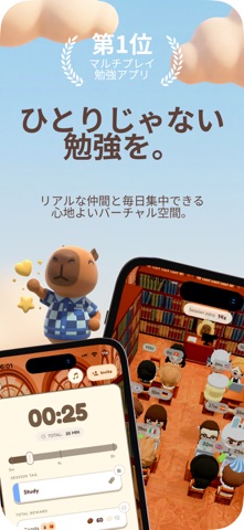


iPad screenshots


Icon palette
About this app
世界中の人たちと、居心地の良い勉強環境で一緒に勉強しよう。Focustownは、1回1回の集中セッションを通して、あなたの夢の実現をサポートします。 お気に入りの雰囲気を選びましょう。居心地の良いカフェ、または静かな図書館。サーバーに参加すると、リアルタイムで勉強している本物の人たちの隣に座って集中できます。試験勉強を頑張る学生でも、次の大きなプロジェクトに取り組む社会人でも、あなたはこの道のりを一人で進む必要はありません。 機能: • 居心地の良い勉強環境 – 美しくデザインされたカフェや図書館から選んで、理想の勉強ムードを作れます。 • 本物の人たちと勉強 – サーバーに参加して、世界中の人たちとリアルタイムで一緒に集中できます。 • コインを獲得してカスタマイズ – 集中セッションを完了してコインを獲得し、楽しいアクセサリーでキャラクターを飾れます。 • 友達と勉強 – 本当の友達とセッションを始めて、お互いに集中をサポートできます。 • 集中タイマー – 勉強を計画的に進め、すべてのセッションを大切にするための内蔵タ…
App details
What you can learn from Focus Town: 友達と一緒に勉強
Every shipping app on the App Store has gone through the same decisions you're working through right now: which screenshot goes first, what caption sits over it, which device frame to show, what color the background should be. The 12 screenshots above are Focus Town: 友達と一緒に勉強's answers to those questions — they're public, they're real, and they made it through Apple's review.
What the numbers say: Focus Town: 友達と一緒に勉強 runs a light set where the background shifts from screenshot to screenshot (first shot #FCFCFC) — each image has to stand on its own, so the captions carry more of the story. The accent colour we picked up, #DC743C, is the one to reuse for badges, arrows and highlighted words if you borrow this look. Hit Use this style to open the editor with these exact colours and drop your own screenshot in.
Notice the first screenshot in particular. It's the one users see in search results and on the product page, and it's where most apps spend their best caption and tightest design. Look at the proportion of background to phone, where the text sits, what one thing the image is trying to communicate.
Want to see how other Productivity apps approach the same problem? Browse more Productivity apps in the showcase.
Take what works into your own screenshots
Open LaunchShots and design your App Store & Google Play screenshots — pick a device frame, drop captions, ship in minutes. Free, in your browser.
Open the screenshot editor →Apps with a similar look
Closest background + accent colours among the listings we've analysed — useful when you want to see the same palette handled by a different team.