Chart position — tracked daily by LaunchShots
Screenshot style breakdown
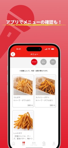
Sampled from 4 of ウタヒロ:「カラオケルーム歌広場」公式アプリ's App Store screenshots — background, accent and theme, measured by LaunchShots (not something Apple publishes).
#FCFCFC bg
#DDDDDD
#E4747C accent
#111111 text
Screenshots



Icon palette
About this app
このアプリは「カラオケルーム歌広場」の公式アプリです。 いつでもソフトドリンク飲み放題!池袋、新宿、渋谷など都内、埼玉、神奈川、千葉に展開中! このアプリダウンロードして会員登録するとお得なクーポンをGETできます!! ■機種変更をこれからされるお客様■ 来店ポイントなどのお客様の会員情報を引き継ぐため、機種変更をされる方は必ず以下をお読みください。 ※機種変更後にログインID、パスワードをお忘れになっていた場合、来店ポイント等の会員情報を引き継げませんのでご注意ください。 万一、会員情報を引き継げなかった場合、新規登録をいただくことになりますので予めご了承ください。 ●ログインIDにGmailなど一般のメールアドレスをご利用のお客様 (1)機種変更前にログインID(メールアドレス)、パスワード、会員番号を忘れないように必ず事前にメモして保管してください。 (2)機種変更後、新たに「ウタヒロ」アプリをダウンロードしていただき、上記(1)のログイン情報でログインしていただくと来店ポイントなどの会員情報が引き継がれ…
App details
What you can learn from ウタヒロ:「カラオケルーム歌広場」公式アプリ
Every shipping app on the App Store has gone through the same decisions you're working through right now: which screenshot goes first, what caption sits over it, which device frame to show, what color the background should be. The 4 screenshots above are ウタヒロ:「カラオケルーム歌広場」公式アプリ's answers to those questions — they're public, they're real, and they made it through Apple's review.
What the numbers say: ウタヒロ:「カラオケルーム歌広場」公式アプリ runs a light set where the background shifts from screenshot to screenshot (first shot #FCFCFC) — each image has to stand on its own, so the captions carry more of the story. The accent colour we picked up, #E4747C, is the one to reuse for badges, arrows and highlighted words if you borrow this look. Hit Use this style to open the editor with these exact colours and drop your own screenshot in.
Notice the first screenshot in particular. It's the one users see in search results and on the product page, and it's where most apps spend their best caption and tightest design. Look at the proportion of background to phone, where the text sits, what one thing the image is trying to communicate.
Want to see how other Lifestyle apps approach the same problem? Browse more Lifestyle apps in the showcase.
Take what works into your own screenshots
Open LaunchShots and design your App Store & Google Play screenshots — pick a device frame, drop captions, ship in minutes. Free, in your browser.
Open the screenshot editor →Apps with a similar look
Closest background + accent colours among the listings we've analysed — useful when you want to see the same palette handled by a different team.