Chart position — tracked daily by LaunchShots
Screenshot changes — detected by LaunchShots
Screenshot style breakdown
Sampled from 6 of حروف مع عزيز - التطبيق الرسمي's App Store screenshots — background, accent and theme, measured by LaunchShots (not something Apple publishes).
#FC7C34 bg
#DD6D2D
#6C3C9C accent
#111111 text
Screenshots


iPad screenshots


Icon palette
About this app
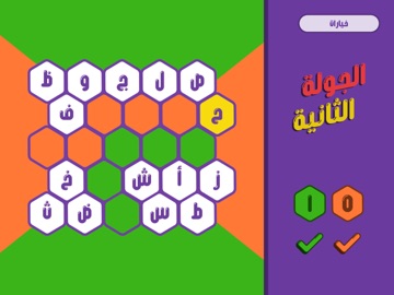
ملاحظة مهمة: التطبيق يقدم تجربة تفاعلية متكاملة للمسابقة، سواء من خلال اللوحة الجماعية التفاعلية أو عبر نمط التحدي الفردي المصمم لتقديم تجربة لعب مستقلة وممتعة في أي وقت، كما أن استخدام التطبيق يتطلب تفعيلًا مسبقًا من خلال شراء التفعيل. نسخة احترافية رسميّة تم تطويرها باستخدام أحد أكبر وأحدث محركات الألعاب المتخصصة مع بوابة إلكترونية تضم أكثر من 3000 سؤال قابل للتحديث والإضافة نسخة احترافية وتفاعلية تتضمن: * شبكة من الخلايا والأحرف العشوائية تتغير في كل مرة بعد لا نهائي * نظام التعرف على الخلايا المتصلة والفوز بشكل تقائي (أو يدوي) * أنماط لعب متنوعة بين النمط الافتراضي ونمط تحدي المجهول ونمط التحدي الفردي! * نظام حساب النقاط والفائزين بكل جولة * إمكانية تغيير اسم المسابقة لتكون: حروف مع [اسمك] * إمكانية تخصيص أسماء المتسابقين * إمكانية عرض الأسئلة إما داخل الخلية أو من خلال البوابة الإلكترونية للأسئلة من جهاز آخر * إمكانية تخصيص الألوان بعدة ألوان مختلفة تناسب أجواء جلستكم * إمكانية ت…
App details
What you can learn from حروف مع عزيز - التطبيق الرسمي
Every shipping app on the App Store has gone through the same decisions you're working through right now: which screenshot goes first, what caption sits over it, which device frame to show, what color the background should be. The 16 screenshots above are حروف مع عزيز - التطبيق الرسمي's answers to those questions — they're public, they're real, and they made it through Apple's review.
What the numbers say: حروف مع عزيز - التطبيق الرسمي runs a mixed light-and-dark set where the background shifts from screenshot to screenshot (first shot #FC7C34) — each image has to stand on its own, so the captions carry more of the story. The accent colour we picked up, #6C3C9C, is the one to reuse for badges, arrows and highlighted words if you borrow this look. Hit Use this style to open the editor with these exact colours and drop your own screenshot in.
Notice the first screenshot in particular. It's the one users see in search results and on the product page, and it's where most apps spend their best caption and tightest design. Look at the proportion of background to phone, where the text sits, what one thing the image is trying to communicate.
Want to see how other Entertainment apps approach the same problem? Browse more Entertainment apps in the showcase.
Take what works into your own screenshots
Open LaunchShots and design your App Store & Google Play screenshots — pick a device frame, drop captions, ship in minutes. Free, in your browser.
Open the screenshot editor →Apps with a similar look
Closest background + accent colours among the listings we've analysed — useful when you want to see the same palette handled by a different team.