Chart position — tracked daily by LaunchShots
Screenshot style breakdown
Sampled from 6 of Ош шаары's App Store screenshots — background, accent and theme, measured by LaunchShots (not something Apple publishes).
#349CF4 bg
#50A9F5
#6C84AC accent
#FFFFFF text
Screenshots



Icon palette
About this app
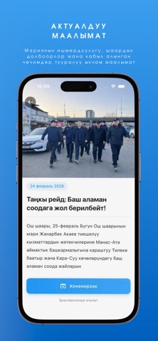
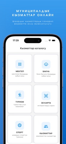
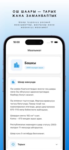
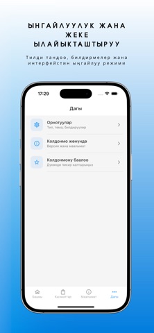
«Ош шаары» — Ош шаарынын мэриясынын расмий мобилдик тиркемеси. Тиркеме аркылуу жарандар жана шаардын коноктору муниципалдык кызматтарга санарип форматта жеткиликтүү болуп, мэриянын ишмердүүлүгү тууралуу актуалдуу жана ишенимдүү маалыматтарды ала алышат. Тиркеменин мүмкүнчүлүктөрү: • Мэрияга онлайн кайрылуу • Шаардык жаңылыктар жана расмий маалыматтар • Муниципалдык кызматтар каталогу • Аба ырайынын актуалдуу болжолу • Шаар тууралуу маалымат (тарыхы, байланыштар, пайдалуу шилтемелер) • Кыргыз жана орус тилдерин колдоо «Ош шаары» — официальное мобильное приложение мэрии города Ош. Приложение предоставляет жителям и гостям города удобный доступ к муниципальным услугам и официальной информации в цифровом формате. Возможности приложения: • Онлайн-обращения в мэрию • Актуальные новости города • Каталог муниципальных услуг • Прогноз погоды • Информация о городе, контакты и полезные ссы…
App details
What you can learn from Ош шаары
Every shipping app on the App Store has gone through the same decisions you're working through right now: which screenshot goes first, what caption sits over it, which device frame to show, what color the background should be. The 7 screenshots above are Ош шаары's answers to those questions — they're public, they're real, and they made it through Apple's review.
What the numbers say: Ош шаары runs a mixed light-and-dark set where the background shifts from screenshot to screenshot (first shot #349CF4) — each image has to stand on its own, so the captions carry more of the story. The accent colour we picked up, #6C84AC, is the one to reuse for badges, arrows and highlighted words if you borrow this look. Hit Use this style to open the editor with these exact colours and drop your own screenshot in.
Notice the first screenshot in particular. It's the one users see in search results and on the product page, and it's where most apps spend their best caption and tightest design. Look at the proportion of background to phone, where the text sits, what one thing the image is trying to communicate.
Want to see how other News apps approach the same problem? Browse more News apps in the showcase.
Take what works into your own screenshots
Open LaunchShots and design your App Store & Google Play screenshots — pick a device frame, drop captions, ship in minutes. Free, in your browser.
Open the screenshot editor →Apps with a similar look
Closest background + accent colours among the listings we've analysed — useful when you want to see the same palette handled by a different team.