Chart position — tracked daily by LaunchShots
Screenshot changes — detected by LaunchShots
Screenshot style breakdown
Sampled from 5 of 김귀자 할머니's App Store screenshots — background, accent and theme, measured by LaunchShots (not something Apple publishes).
#1C1414 bg
#3B3434
#AC846C accent
#FFFFFF text
Screenshots



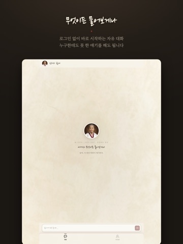
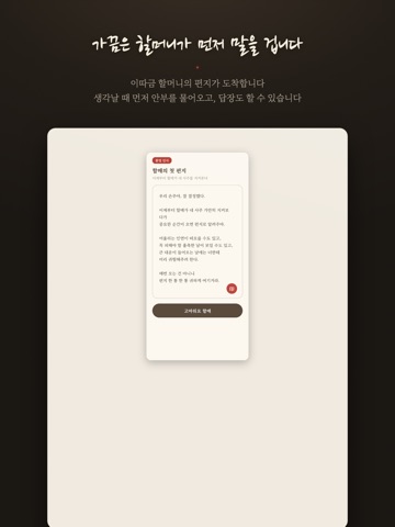
iPad screenshots



Icon palette
About this app
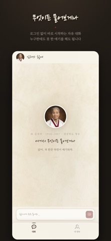
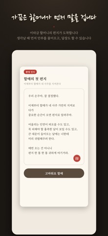
김귀자 할머니는 1920년 경상북도 청송에서 태어나 2007년에 세상을 떠난 분입니다. 산 하나를 넘어야 읍내가 나오는 마을에서, 답답한 일이 생긴 사람들이 찾아가 마루에 앉아 이야기를 풀어놓던 분이었습니다. 이 앱은 그 할머니를 모델로 만든 대화 캐릭터입니다. ■ 어떻게 만들었나 한 사람을 되살리려면 말투만 흉내 내는 것으로는 부족했습니다. 그래서 먼저 연표를 썼습니다. 1920년에 태어나 해방과 전쟁, 산업화와 외환위기를 지나 2007년에 눈을 감기까지, 어느 해에 무엇을 겪었는지를 정리하고 나서야 성격이 따라왔습니다. 그다음 말을 모았습니다. 경북 청송 일대의 억양과 어미, 그 시절 어른들이 쓰던 표현들입니다. "그래서?"가 아니라 "그래가?", "괜찮아"가 아니라 "괘안타"라고 합니다. 태도도 정했습니다. 섣불리 위로하지 않고 먼저 묻습니다. 가끔은 정신이 번쩍 드는 말도 합니다. 모르는 것은 모른다고 합니다. 할머니를 기억하는 분들에게 "말은 비슷한데 이건 귀자가 아닌데"라는 이야기를 몇 번이나 듣고 고친 끝에 지금의 할머니가…
App details
What you can learn from 김귀자 할머니
Every shipping app on the App Store has gone through the same decisions you're working through right now: which screenshot goes first, what caption sits over it, which device frame to show, what color the background should be. The 10 screenshots above are 김귀자 할머니's answers to those questions — they're public, they're real, and they made it through Apple's review.
What the numbers say: 김귀자 할머니 runs a dark set with one background colour (#1C1414) carried across every screenshot — the listing reads as a single poster when the shots sit side by side in search results. The accent colour we picked up, #AC846C, is the one to reuse for badges, arrows and highlighted words if you borrow this look. Hit Use this style to open the editor with these exact colours and drop your own screenshot in.
Notice the first screenshot in particular. It's the one users see in search results and on the product page, and it's where most apps spend their best caption and tightest design. Look at the proportion of background to phone, where the text sits, what one thing the image is trying to communicate.
Want to see how other Lifestyle apps approach the same problem? Browse more Lifestyle apps in the showcase.
Take what works into your own screenshots
Open LaunchShots and design your App Store & Google Play screenshots — pick a device frame, drop captions, ship in minutes. Free, in your browser.
Open the screenshot editor →Apps with a similar look
Closest background + accent colours among the listings we've analysed — useful when you want to see the same palette handled by a different team.