Chart position — tracked daily by LaunchShots
Screenshot changes — detected by LaunchShots
Screenshot style breakdown
Sampled from 5 of Ghost Tide:ร่างทรงผี's App Store screenshots — background, accent and theme, measured by LaunchShots (not something Apple publishes).
#0C0C14 bg
#2E2E34
#84644C accent
#FFFFFF text
Reading the caption text from the screenshots in your browser…
Screenshots


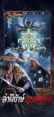
iPad screenshots
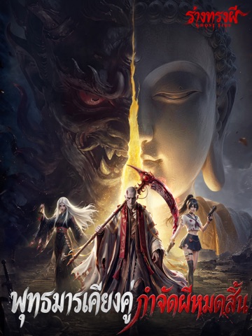
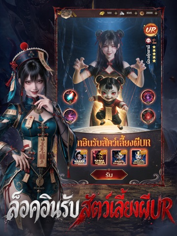

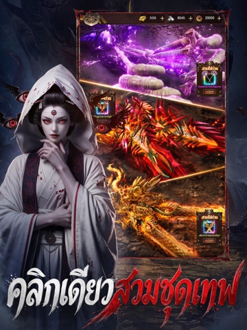

Icon palette
About this app
【Ghost Tide – อาณาจักรผีทั่วโลกกำลังรอคุณ!】 ไม่ว่าคุณจะกลัวผีหรือหลงใหลในเรื่องลึกลับ Ghost Tide จะพาคุณดำดิ่งสู่โลกแห่งความสยองที่รวมเอาผีสางจากทุกมุมโลก จากจีน ญี่ปุ่น ไทย ไปจนถึงตำนานตะวันตก เข้าสู่มิติวิญญาณ ที่คุณคือร่างทรงผู้ควบคุมพลังเหนือธรรมชาติ สำรวจดินแดนผี – เปิดเผยความลับที่ซ่อนอยู่ บุกเข้าดินแดนผีที่เต็มไปด้วยสุสานร้าง ปราสาทต้องคำสาป และวิหารใต้บาดาล ทุกแผนที่คือคำทำนายใหม่ พร้อมภารกิจเนื้อเรื่องที่จะทำให้คุณลุ้นทั้งขวัญและรางวัล รับสัตว์เลี้ยงผีUR ทันทีหลังเข้าเกม! เริ่มต้นเส้นทางร่างทรงด้วย สัตว์เลี้ยงผีระดับ URพลังโจมตีสูงสุด พร้อมสกินจำกัดเวลา – ม้าผีเรืองแสง – อาวุธลิมิเต็ดออริจินัล – เพชรจำนวนมหาศาลสำหรับอัปเกรดทันที เรียกวิญญาณ – คุมศพ ปกครองสองภพ ปลุกวิญญาณเทพยดาและปีศาจโบราณเพื่อเป็นเกราะคุ้มกัน เรียนรู้มนต์คุมศพอันลี้ลับ ควบคุมกองทัพซอมบี้ และเป็นใหญ่ทั้งในโลกคนและโลกวิญญาณ ลงดันเจี้ยนร่วมกับผองเพื่อน – ล่าผียักษ์ ออกผจญภัยในดันเจี้ยนทีม ปะทะบอสผีระดับตำ…
App details
What you can learn from Ghost Tide:ร่างทรงผี
Every shipping app on the App Store has gone through the same decisions you're working through right now: which screenshot goes first, what caption sits over it, which device frame to show, what color the background should be. The 10 screenshots above are Ghost Tide:ร่างทรงผี's answers to those questions — they're public, they're real, and they made it through Apple's review.
What the numbers say: Ghost Tide:ร่างทรงผี runs a dark set with one background colour (#0C0C14) carried across every screenshot — the listing reads as a single poster when the shots sit side by side in search results. The accent colour we picked up, #84644C, is the one to reuse for badges, arrows and highlighted words if you borrow this look. Hit Use this style to open the editor with these exact colours and drop your own screenshot in.
Notice the first screenshot in particular. It's the one users see in search results and on the product page, and it's where most apps spend their best caption and tightest design. Look at the proportion of background to phone, where the text sits, what one thing the image is trying to communicate.
Want to see how other Games apps approach the same problem? Browse more Games apps in the showcase.
Take what works into your own screenshots
Open LaunchShots and design your App Store & Google Play screenshots — pick a device frame, drop captions, ship in minutes. Free, in your browser.
Open the screenshot editor →Apps with a similar look
Closest background + accent colours among the listings we've analysed — useful when you want to see the same palette handled by a different team.