Screenshot style breakdown
Sampled from 6 of OstWest Zeitzeugen's App Store screenshots — background, accent and theme, measured by LaunchShots (not something Apple publishes).
#FC4C5C bg
#FC6572
#041C54 accent
#FFFFFF text
Screenshots
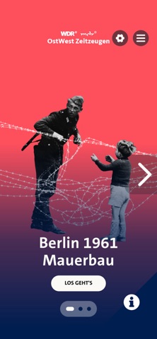

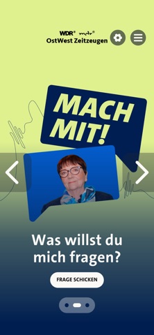


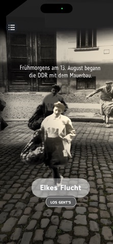
iPad screenshots


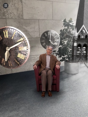

Icon palette
About this app
In der Augmented Reality-App „OstWest Zeitzeugen – Mauerjahre in AR“ erzählen Zeitzeugen vom dramatischen Bau der Berliner Mauer 1961: Elke Rosin floh damals kurzentschlossen nach West-Berlin. Jörg Hildebrandt blieb in der DDR, obwohl er das politische System ablehnte. Und Uwe Rutkowski bewachte als Volkspolizist die Grenzschließung, bekam aber immer mehr Zweifel. Mit Augmented Reality können die Zeitzeugen virtuell in realen Räumen platziert werden. Sie sitzen auf Augenhöhe gegenüber – ganz nah und unmittelbar. In der App steht zunächst das erste Kapitel „Mauerbau“ zum 65. Jahrestag des Baus der Berliner Mauer. Bis 2029 kommen regelmäßig neue Kapitel hinzu, so dass die App die Geschichte der deutschen Teilung vom Mauerbau bis heute umfassen wird. Wir freuen uns über Feedback unter ar@wdr.de und eine Bewertung. WIE KANNST DU MITMACHEN? Schau dir die Erzählungen der Zeitzeugen an, sc…
App details
What you can learn from OstWest Zeitzeugen
Every shipping app on the App Store has gone through the same decisions you're working through right now: which screenshot goes first, what caption sits over it, which device frame to show, what color the background should be. The 14 screenshots above are OstWest Zeitzeugen's answers to those questions — they're public, they're real, and they made it through Apple's review.
What the numbers say: OstWest Zeitzeugen runs a mixed light-and-dark set where the background shifts from screenshot to screenshot (first shot #FC4C5C) — each image has to stand on its own, so the captions carry more of the story. The accent colour we picked up, #041C54, is the one to reuse for badges, arrows and highlighted words if you borrow this look. Hit Use this style to open the editor with these exact colours and drop your own screenshot in.
Notice the first screenshot in particular. It's the one users see in search results and on the product page, and it's where most apps spend their best caption and tightest design. Look at the proportion of background to phone, where the text sits, what one thing the image is trying to communicate.
Want to see how other Education apps approach the same problem? Browse more Education apps in the showcase.
Take what works into your own screenshots
Open LaunchShots and design your App Store & Google Play screenshots — pick a device frame, drop captions, ship in minutes. Free, in your browser.
Open the screenshot editor →Apps with a similar look
Closest background + accent colours among the listings we've analysed — useful when you want to see the same palette handled by a different team.