Screenshot style breakdown
Sampled from 6 of Уютная флористика's App Store screenshots — background, accent and theme, measured by LaunchShots (not something Apple publishes).
#2C4434 bg
#495E50
#B4CC44 accent
#FFFFFF text
Screenshots
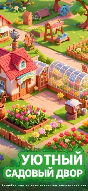
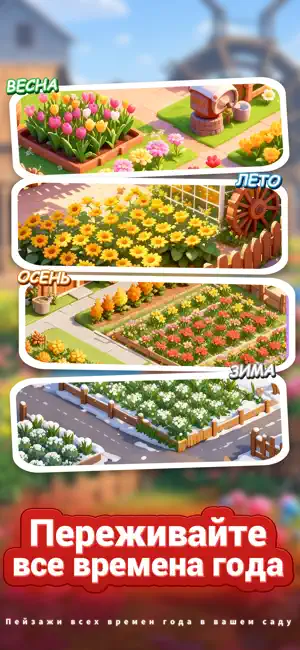
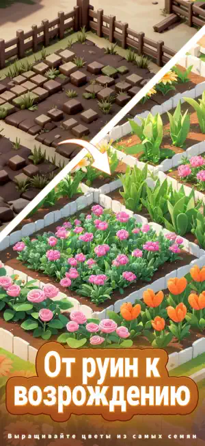
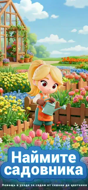
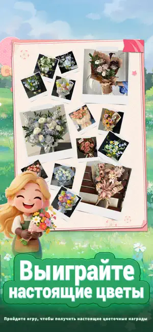
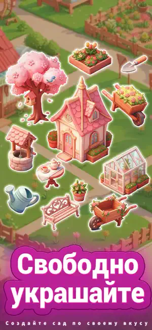
Icon palette
About this app
Ищете душевную игру, чтобы расслабиться и не скучать? Хотите встретить единомышленников, но боитесь неловкости в общении? Эта игра, полная цветов и сюрпризов, решит все ваши проблемы! Двойной геймплей: управление садом + цветочным магазином — терапевтично и весело, а кроме того, вас ждут призы в виде настоящих цветов! Откройте мир цветов, управляйте собственным садом и магазином Погрузитесь в разнообразный мир флоры в The Cozy Florist! От ромашек и ландышей до редких тюльпанов — создайте своими руками уникальный сад и управляйте персонализированным цветочным магазином. Это чистое наслаждение и покой! Взаимодействие с кражей цветов: захватывающе и снимает стресс Заметили яркие розы, цветущие в саду друга? Стащите несколько бутонов, но будьте осторожны — не попадитесь! Умыкнуть редкие семена цветов — это приносит колоссальное чувство удовлетворения! Общение в садах: легко находите дру…
App details
What you can learn from Уютная флористика
Every shipping app on the App Store has gone through the same decisions you're working through right now: which screenshot goes first, what caption sits over it, which device frame to show, what color the background should be. The 6 screenshots above are Уютная флористика's answers to those questions — they're public, they're real, and they made it through Apple's review.
What the numbers say: Уютная флористика runs a mixed light-and-dark set where the background shifts from screenshot to screenshot (first shot #2C4434) — each image has to stand on its own, so the captions carry more of the story. The accent colour we picked up, #B4CC44, is the one to reuse for badges, arrows and highlighted words if you borrow this look. Hit Use this style to open the editor with these exact colours and drop your own screenshot in.
Notice the first screenshot in particular. It's the one users see in search results and on the product page, and it's where most apps spend their best caption and tightest design. Look at the proportion of background to phone, where the text sits, what one thing the image is trying to communicate.
Want to see how other Games apps approach the same problem? Browse more Games apps in the showcase.
Take what works into your own screenshots
Open LaunchShots and design your App Store & Google Play screenshots — pick a device frame, drop captions, ship in minutes. Free, in your browser.
Open the screenshot editor →Apps with a similar look
Closest background + accent colours among the listings we've analysed — useful when you want to see the same palette handled by a different team.