Chart position — tracked daily by LaunchShots
Screenshot style breakdown
Sampled from 6 of رسم وتلوين للاطفال بدون نت's App Store screenshots — background, accent and theme, measured by LaunchShots (not something Apple publishes).
#9CCCFC bg
#89B3DD
#FC4454 accent
#111111 text
Screenshots



iPad screenshots





Icon palette
About this app
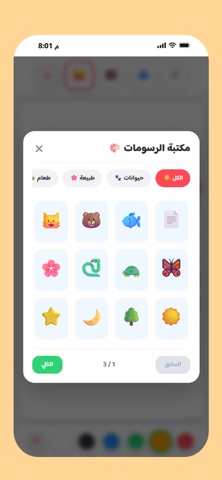
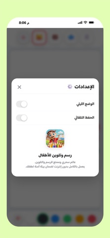
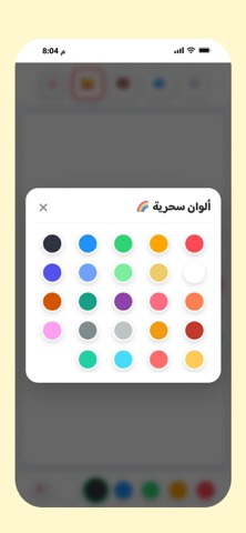
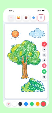
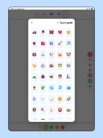
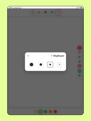
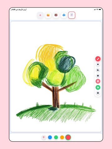
مرحباً بكم في تطبيق "رسم وتلوين للأطفال بدون نت"، البيئة الآمنة والممتعة التي تطلق العنان لخيال وإبداع طفلك! صُمم هذا التطبيق خصيصاً ليناسب الأطفال بمختلف أعمارهم، حيث يوفر واجهة سهلة الاستخدام بألوان جذابة وأدوات بسيطة تتيح لهم رسم لوحاتهم الخاصة أو تلوين رسوماتهم بكل سهولة. والأهم من ذلك، أن التطبيق يعمل بالكامل بدون الحاجة للاتصال بالإنترنت، مما يضمن تجربة آمنة خالية من الإلهاءات، ويجعله الرفيق المثالي لطفلك في أي وقت وفي كل مكان. أهم مميزات التطبيق: - يعمل بدون إنترنت (Offline): لا داعي للقلق بشأن الاتصال بالشبكة، يمكن لطفلك الرسم والتلوين في السيارة أو الطائرة أو أي مكان. - واجهة بسيطة وآمنة: تصميم مخصص للأطفال ليسهل عليهم اختيار الألوان والأدوات بأنفسهم. - أدوات رسم متنوعة: مجموعة رائعة من الفرش والأقلام بأحجام مختلفة لتناسب جميع اللمسات الفنية. - مكتبة ألوان غنية: لوحة ألوان زاهية وواسعة تتيح للطفل استكشاف الألوان ومزجها. - حفظ الأعمال الفنية: بضغطة زر، يمكن حفظ رسومات طفلك وإ…
App details
What you can learn from رسم وتلوين للاطفال بدون نت
Every shipping app on the App Store has gone through the same decisions you're working through right now: which screenshot goes first, what caption sits over it, which device frame to show, what color the background should be. The 18 screenshots above are رسم وتلوين للاطفال بدون نت's answers to those questions — they're public, they're real, and they made it through Apple's review.
What the numbers say: رسم وتلوين للاطفال بدون نت runs a light set where the background shifts from screenshot to screenshot (first shot #9CCCFC) — each image has to stand on its own, so the captions carry more of the story. The accent colour we picked up, #FC4454, is the one to reuse for badges, arrows and highlighted words if you borrow this look. Hit Use this style to open the editor with these exact colours and drop your own screenshot in.
Notice the first screenshot in particular. It's the one users see in search results and on the product page, and it's where most apps spend their best caption and tightest design. Look at the proportion of background to phone, where the text sits, what one thing the image is trying to communicate.
Want to see how other Graphics & Design apps approach the same problem? Browse more Graphics & Design apps in the showcase.
Take what works into your own screenshots
Open LaunchShots and design your App Store & Google Play screenshots — pick a device frame, drop captions, ship in minutes. Free, in your browser.
Open the screenshot editor →Apps with a similar look
Closest background + accent colours among the listings we've analysed — useful when you want to see the same palette handled by a different team.