Chart position — tracked daily by LaunchShots
Screenshot style breakdown
Sampled from 6 of コードギアス ナイトメア・サバイバー's App Store screenshots — background, accent and theme, measured by LaunchShots (not something Apple publishes).
#FCFCFC bg
#DDDDDD
#546484 accent
#111111 text
Screenshots
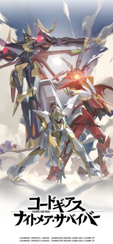


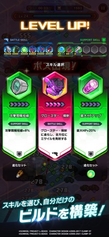
iPad screenshots
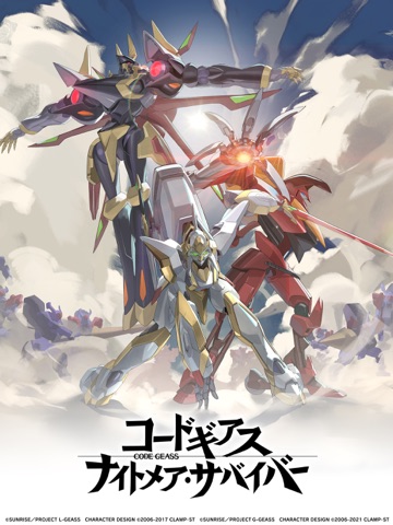


Icon palette
About this app
『コードギアス ナイトメア・サバイバー(ギアサバ)』 ◆◆ 「コードギアス」の世界を「サバイバーアクション」でプレイしよう! ◆◆ ナイトメアフレーム(KMF)とキャラクターのスキルを駆使し、敵の大群を一掃する爽快サバイバーアクション。自分だけのパーティーを構築し、激化する戦場を生き延びろ! ◆◆ ゲームの特徴 ◆◆ 【ナイトメアフレームを強化し、戦場の覇者となれ!】 コードギアスで活躍する機動兵器「ナイトメアフレーム(KMF)」をレベルアップ・覚醒させ、さらなる力を引き出そう。強化したKMFを操り、圧倒的な力を見せつけよう! 【キャラクターとCODEリンクでパーティーを強化!】 ルルーシュやスザク、C.C.といったおなじみの人気キャラクターをパーティーに編成し、KMFのステータスを底上げしよう。多彩な効果を持つCODEリンクも組み合わせ、最強のパーティーを目指せ! 【シナリオでルルーシュたちの物語を追体験!】 コードギアスの世界観を忠実に再現したシナリオを収録。原作では語られなかったオリジナルエピソードも一部収録。 【ラ…
App details
What you can learn from コードギアス ナイトメア・サバイバー
Every shipping app on the App Store has gone through the same decisions you're working through right now: which screenshot goes first, what caption sits over it, which device frame to show, what color the background should be. The 14 screenshots above are コードギアス ナイトメア・サバイバー's answers to those questions — they're public, they're real, and they made it through Apple's review.
What the numbers say: コードギアス ナイトメア・サバイバー runs a mixed light-and-dark set where the background shifts from screenshot to screenshot (first shot #FCFCFC) — each image has to stand on its own, so the captions carry more of the story. The accent colour we picked up, #546484, is the one to reuse for badges, arrows and highlighted words if you borrow this look. Hit Use this style to open the editor with these exact colours and drop your own screenshot in.
Notice the first screenshot in particular. It's the one users see in search results and on the product page, and it's where most apps spend their best caption and tightest design. Look at the proportion of background to phone, where the text sits, what one thing the image is trying to communicate.
Want to see how other Games apps approach the same problem? Browse more Games apps in the showcase.
Take what works into your own screenshots
Open LaunchShots and design your App Store & Google Play screenshots — pick a device frame, drop captions, ship in minutes. Free, in your browser.
Open the screenshot editor →Apps with a similar look
Closest background + accent colours among the listings we've analysed — useful when you want to see the same palette handled by a different team.