Chart position — tracked daily by LaunchShots
Screenshot style breakdown
Sampled from 5 of PigPro's App Store screenshots — background, accent and theme, measured by LaunchShots (not something Apple publishes).
#0C6CDC bg
#2E80E0
#4C5C7C accent
#FFFFFF text
Reading the caption text from the screenshots in your browser…
Screenshots


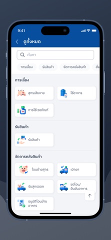
iPad screenshots


Icon palette
About this app
แอปพลิเคชัน PigPro (พิกโปร) โดย AXONS ระบบจัดการฟาร์มสุกรอัจฉริยะเพื่อเกษตรกรไทย ยกระดับการทำงานด้วยนวัตกรรมระดับสากล PigPro (พิกโปร) คือแอปพลิเคชันที่ออกแบบมาเพื่อช่วยให้เกษตรกรและผู้จัดการฟาร์มสุกร สามารถบริหารจัดการฟาร์มได้อย่างมีประสิทธิภาพ สะดวก รวดเร็ว และแม่นยำ ทุกที่ทุกเวลา ผ่านสมาร์ทโฟนของคุณ ด้วยอินเทอร์เฟซที่ใช้งานง่าย ตอบโจทย์ทุกขั้นตอนของการเลี้ยงสุกร ตั้งแต่การจัดการโรงเรือน คลังสินค้า ไปจนถึงการดูแลสุขภาพสัตว์ ฟีเจอร์และฟังก์ชันการทำงานที่โดดเด่น: 1. แดชบอร์ดอัจฉริยะ (Smart Dashboard) หน้าจอหลัก (Home) ที่ปรับแต่งเมนูโปรด (เมนูของฉัน) ให้เข้าถึงฟังก์ชันที่ใช้บ่อยได้อย่างรวดเร็ว แสดงข้อมูลสภาพอากาศแบบเรียลไทม์ (อ้างอิงจากตำแหน่งที่ตั้งฟาร์ม) เพื่อช่วยในการวางแผนการเลี้ยง รองรับการจัดการหลายฟาร์ม สามารถกด "สลับฟาร์ม/โรงเรือน" ได้ทันที 2. ผู้ช่วยสุขภาพสัตว์ "Moo D" (หมูดี AI Chatbot) ฟีเจอร์แชทบอทสุดล้ำที่เปรียบเสมือนผู้ช่วยสัตวแพทย์ประจำฟาร์ม สามารถสอบถามอาการผิดปกติของส…
App details
What you can learn from PigPro
Every shipping app on the App Store has gone through the same decisions you're working through right now: which screenshot goes first, what caption sits over it, which device frame to show, what color the background should be. The 10 screenshots above are PigPro's answers to those questions — they're public, they're real, and they made it through Apple's review.
What the numbers say: PigPro runs a mixed light-and-dark set where the background shifts from screenshot to screenshot (first shot #0C6CDC) — each image has to stand on its own, so the captions carry more of the story. The accent colour we picked up, #4C5C7C, is the one to reuse for badges, arrows and highlighted words if you borrow this look. Hit Use this style to open the editor with these exact colours and drop your own screenshot in.
Notice the first screenshot in particular. It's the one users see in search results and on the product page, and it's where most apps spend their best caption and tightest design. Look at the proportion of background to phone, where the text sits, what one thing the image is trying to communicate.
Want to see how other Business apps approach the same problem? Browse more Business apps in the showcase.
Take what works into your own screenshots
Open LaunchShots and design your App Store & Google Play screenshots — pick a device frame, drop captions, ship in minutes. Free, in your browser.
Open the screenshot editor →Apps with a similar look
Closest background + accent colours among the listings we've analysed — useful when you want to see the same palette handled by a different team.