Chart position — tracked daily by LaunchShots
Screenshot changes — detected by LaunchShots
Screenshot style breakdown
Sampled from 4 of seamless's App Store screenshots — background, accent and theme, measured by LaunchShots (not something Apple publishes).
#F4F4F4 bg
#D6D6D6
#ECD454 accent
#111111 text
Screenshots


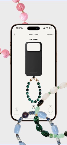
iPad screenshots
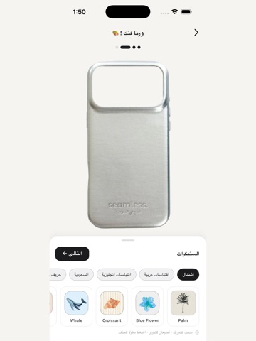


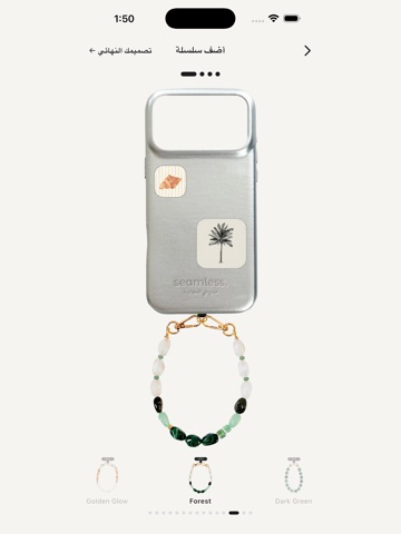
Icon palette
About this app
صمم كفر آيفونك المثالي — وانت مرتاح في بيتك. سيملس يخلي آيفونك لوحة فنية. اختر من كفرات سيليكون، بلاستيك، وال Elite الفاخر. زيّنها بالستيكرات — خط عربي، اقتباسات، أشكال، حروف، تواريخ. أضف سلسلة ملونة. شوف كفرك بالضبط قبل ما تطلبه. تصميم مباشر اسحب الستيكرات وين ما تبي. دوّرها بأصبعين، احذفها بضغطة طويلة. كل تعديل يطلع فوراً — محرر سلس مثل ما ترسم على ورقة. مجموعة كفرات فاخرة أكثر من 20 لون من السيليكون، البلاستيك، وخط Elite الفاخر. كل كفر مصور في الاستديو عشان تشوفه بالظبط زي ما رح تستلمه. مئات الستيكرات • حروف عربية (28 حرف، كامل الأبجدية) • اقتباسات عربية (أكثر من 60 عبارة) • حروف واقتباسات انجليزية • شهور السنة، سنوات ميلادية • ستيكرات السعودية • أشكال زخرفية — ورود، حيوانات، قلوب، مشروبات أضف سلسلة مجموعة متجددة من السلاسل — لؤلؤ، صدف بحر، أخضر غابات، ذهبي — تخلي كفرك يلفت النظر أكثر. احفظ تصاميمك احفظ تصاميمك على جوالك بدون التزام. ارجع لها بعد أيام، عدّل عليها، أو اطلبها بلو…
App details
What you can learn from seamless
Every shipping app on the App Store has gone through the same decisions you're working through right now: which screenshot goes first, what caption sits over it, which device frame to show, what color the background should be. The 8 screenshots above are seamless's answers to those questions — they're public, they're real, and they made it through Apple's review.
What the numbers say: seamless runs a light set with one background colour (#F4F4F4) carried across every screenshot — the listing reads as a single poster when the shots sit side by side in search results. The accent colour we picked up, #ECD454, is the one to reuse for badges, arrows and highlighted words if you borrow this look. Hit Use this style to open the editor with these exact colours and drop your own screenshot in.
Notice the first screenshot in particular. It's the one users see in search results and on the product page, and it's where most apps spend their best caption and tightest design. Look at the proportion of background to phone, where the text sits, what one thing the image is trying to communicate.
Want to see how other Graphics & Design apps approach the same problem? Browse more Graphics & Design apps in the showcase.
Take what works into your own screenshots
Open LaunchShots and design your App Store & Google Play screenshots — pick a device frame, drop captions, ship in minutes. Free, in your browser.
Open the screenshot editor →Apps with a similar look
Closest background + accent colours among the listings we've analysed — useful when you want to see the same palette handled by a different team.