Screenshot changes — detected by LaunchShots
Screenshot style breakdown
Sampled from 3 of ميقات AI : منبه الفجر الذكي's App Store screenshots — background, accent and theme, measured by LaunchShots (not something Apple publishes).
#F4ECE4 bg
#D6CFC8
#1C4C44 accent
#111111 text
Reading the caption text from the screenshots in your browser…
Screenshots

Icon palette
About this app
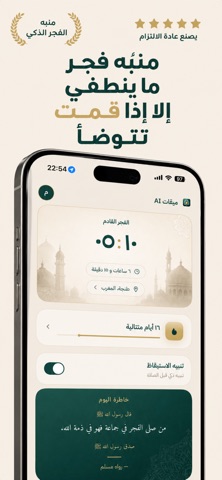
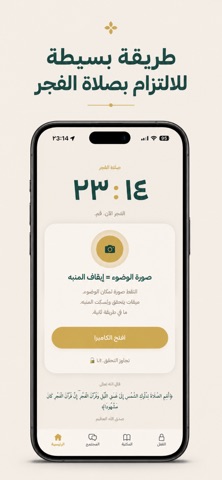
ميقات AI هو أول تطبيق منبه فجر لا يمكن إيقافه إلا بالتزامك. المنبه يرن. الطريقة الوحيدة لإيقافه: صوّر نفسك في مكان الوضوء. الذكاء الاصطناعي يتحقق. وبس كذا يسكت المنبه. ليش ميقات مختلف؟ - منبه لا ينطفئ بدون صورة حقيقية — ما في زر إغلاق - الذكاء الاصطناعي يتحقق من صورتك فورًا - سلسلة يومية تتبع التزامك بصلاة الفجر - صورتك لا تُحفظ ولا تُرسل لأي شخص — الخصوصية أولوية - تصميم عربي بالكامل — مو ترجمة ابدأ تجربة مجانية لـ ٣ أيام. إذا ما أحسيت بفرق — ألغِ بسهولة من الإعدادات. ميقات AI يتطلب اشتراكًا مدفوعًا للوصول إلى جميع الميزات. - اشتراك سنوي: 199 ريال سعودي / سنة (يشمل تجربة مجانية لمدة 3 أيام) - اشتراك شهري: 99 ريال سعودي / شهر تُخصم قيمة الاشتراك من حساب Apple ID عند تأكيد الشراء، ويتجدد تلقائيًا بالسعر نفسه ما لم يتم إيقاف التجديد التلقائي قبل 24 ساعة على الأقل من انتهاء الفترة الحالية. يمكنك إدارة الاشتراك أو إلغاؤه من إعدادات حساب Apple ID. عند الاشتراك يسقط أي جزء غير مستخدم من …
App details
What you can learn from ميقات AI : منبه الفجر الذكي
Every shipping app on the App Store has gone through the same decisions you're working through right now: which screenshot goes first, what caption sits over it, which device frame to show, what color the background should be. The 3 screenshots above are ميقات AI : منبه الفجر الذكي's answers to those questions — they're public, they're real, and they made it through Apple's review.
What the numbers say: ميقات AI : منبه الفجر الذكي runs a light set with one background colour (#F4ECE4) carried across every screenshot — the listing reads as a single poster when the shots sit side by side in search results. The accent colour we picked up, #1C4C44, is the one to reuse for badges, arrows and highlighted words if you borrow this look. Hit Use this style to open the editor with these exact colours and drop your own screenshot in.
Notice the first screenshot in particular. It's the one users see in search results and on the product page, and it's where most apps spend their best caption and tightest design. Look at the proportion of background to phone, where the text sits, what one thing the image is trying to communicate.
Want to see how other Lifestyle apps approach the same problem? Browse more Lifestyle apps in the showcase.
Take what works into your own screenshots
Open LaunchShots and design your App Store & Google Play screenshots — pick a device frame, drop captions, ship in minutes. Free, in your browser.
Open the screenshot editor →Apps with a similar look
Closest background + accent colours among the listings we've analysed — useful when you want to see the same palette handled by a different team.