Screenshot style breakdown
Sampled from 6 of Lunds Akademiska GK's App Store screenshots — background, accent and theme, measured by LaunchShots (not something Apple publishes).
#FCFCFC bg
#DDDDDD
#BCBC5C accent
#111111 text
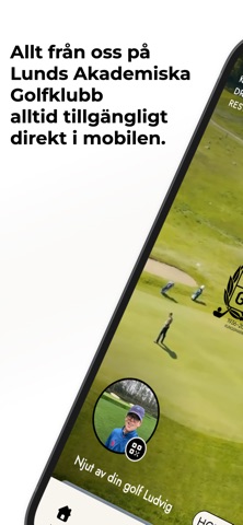
- #1Allt fran oss pa Lunds Akademiska Golfklubb
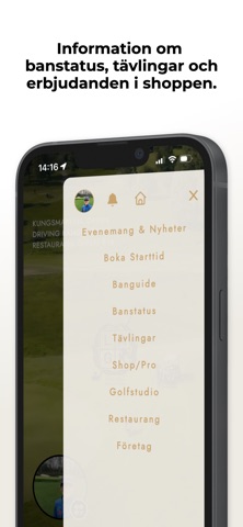
- #3Information om banstatus, tavlingar och erbjudanden i shoppen.
- #4Tillgang till klubbens, och 40.000 andra GPS-banguider.
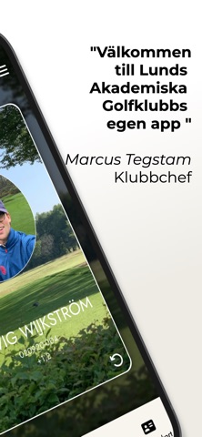
- #6"Valkommen till Lunds Akademiska
Captions read from the screenshots (OCR, may contain small errors): 4 headlines, 6.5 words on average (longest 8).
Screenshots



Icon palette
About this app
Välkommen till den officiella appen för Lunds Akademiska Golfklubb. Vi har skapat en plattform som samlar hela din golfvardag på ett ställe, så att du kan lägga fullt fokus på ditt spel. I appen har du direkt tillgång till aktuella klubbnyheter, tävlingsinformation och viktiga banuppdateringar direkt i fickan. Genom att logga in med ditt Golf-ID förvandlas appen till din personliga portal. Här hittar du ditt digitala medlemskort och får notiser samt innehåll som är skräddarsytt efter dig som medlem. Appen är utformad för att stärka gemenskapen inom LAGK och underlätta din golfvardag, oavsett om du sitter vid skrivbordet eller står redo på första tee. Utöver de senaste nyheterna ger appen dig verktygen att hantera dina bokningar med enkelhet. Håll koll på dina tider, ta del av klubbens event kalender och se till att du alltid är uppdaterad om vad som händer på vår bana. Det är det perf…
App details
What you can learn from Lunds Akademiska GK
Every shipping app on the App Store has gone through the same decisions you're working through right now: which screenshot goes first, what caption sits over it, which device frame to show, what color the background should be. The 6 screenshots above are Lunds Akademiska GK's answers to those questions — they're public, they're real, and they made it through Apple's review.
What the numbers say: Lunds Akademiska GK runs a light set with one background colour (#FCFCFC) carried across every screenshot — the listing reads as a single poster when the shots sit side by side in search results. The accent colour we picked up, #BCBC5C, is the one to reuse for badges, arrows and highlighted words if you borrow this look. Hit Use this style to open the editor with these exact colours and drop your own screenshot in.
Notice the first screenshot in particular. It's the one users see in search results and on the product page, and it's where most apps spend their best caption and tightest design. Look at the proportion of background to phone, where the text sits, what one thing the image is trying to communicate.
Want to see how other Sports apps approach the same problem? Browse more Sports apps in the showcase.
Take what works into your own screenshots
Open LaunchShots and design your App Store & Google Play screenshots — pick a device frame, drop captions, ship in minutes. Free, in your browser.
Open the screenshot editor →Apps with a similar look
Closest background + accent colours among the listings we've analysed — useful when you want to see the same palette handled by a different team.