Chart position — tracked daily by LaunchShots
Screenshot changes — detected by LaunchShots
Screenshot style breakdown
Sampled from 6 of Свеча — православный спутник's App Store screenshots — background, accent and theme, measured by LaunchShots (not something Apple publishes).
#3C2C1C bg
#57493B
#5444E4 accent
#FFFFFF text
Reading the caption text from the screenshots in your browser…
Screenshots
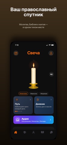
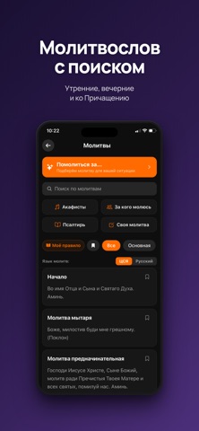


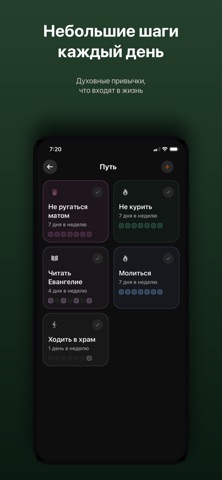
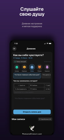


iPad screenshots
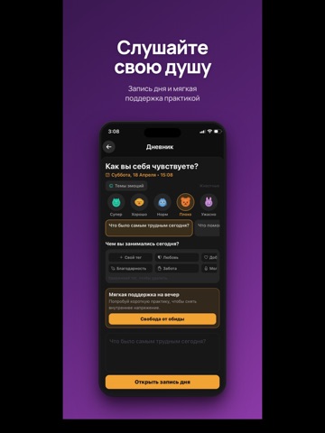


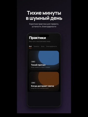


Icon palette
About this app
СВЕЧА — ВАШ ПРАВОСЛАВНЫЙ СПУТНИК «Свеча» — тихое место для духовной жизни на каждый день. Молитва, Писание, жития святых и живой помощник — всё в одном приложении, всегда с вами. БИБЛИЯ • Полный текст: Синодальный перевод и церковнославянский • Аудио-Библия — более 1000 озвученных глав, авто-переход между главами • Поиск, закладки, заметки, прогресс чтения • Евангелие дня • Чтение без интернета ЖИТИЯ СВЯТЫХ • Более 100 полных житий: Николай Чудотворец, Сергий Радонежский, Серафим Саровский, Пантелеимон, Георгий Победоносец и другие • Поиск по святым • Классические тексты (свт. Димитрий Ростовский) МОЛИТВОСЛОВ • Утренние и вечерние молитвы, ко Святому Причащению • Поиск по молитвам — по названию и тексту • Личное молитвенное правило, собранное с помощью AI • Таймер и озвучка АУДИО • Песнопения (в том числе древние распевы) и аудио-молитвы • «Беседы» — тихое слово и молитва на разные…
App details
What you can learn from Свеча — православный спутник
Every shipping app on the App Store has gone through the same decisions you're working through right now: which screenshot goes first, what caption sits over it, which device frame to show, what color the background should be. The 18 screenshots above are Свеча — православный спутник's answers to those questions — they're public, they're real, and they made it through Apple's review.
What the numbers say: Свеча — православный спутник runs a dark set where the background shifts from screenshot to screenshot (first shot #3C2C1C) — each image has to stand on its own, so the captions carry more of the story. The accent colour we picked up, #5444E4, is the one to reuse for badges, arrows and highlighted words if you borrow this look. Hit Use this style to open the editor with these exact colours and drop your own screenshot in.
Notice the first screenshot in particular. It's the one users see in search results and on the product page, and it's where most apps spend their best caption and tightest design. Look at the proportion of background to phone, where the text sits, what one thing the image is trying to communicate.
Want to see how other Reference apps approach the same problem? Browse more Reference apps in the showcase.
Take what works into your own screenshots
Open LaunchShots and design your App Store & Google Play screenshots — pick a device frame, drop captions, ship in minutes. Free, in your browser.
Open the screenshot editor →Apps with a similar look
Closest background + accent colours among the listings we've analysed — useful when you want to see the same palette handled by a different team.