Screenshot style breakdown
Sampled from 6 of FlareSpot's App Store screenshots — background, accent and theme, measured by LaunchShots (not something Apple publishes).
#042C44 bg
#27495E
#54F4E4 accent
#FFFFFF text
Screenshots


Icon palette
About this app
街で眠る「ねむねむムー」に、みんなで「おはよう」を。種を植え、植物に水をあげる楽しみが、いつもの地図に加わりました。 FlareSpotは、フェス・LIVE・花火・街のイベントと、その場所に集まる「今の声」を地図で見つけて楽しむアプリです。目的地がない日にも、ふと開きたくなる地図を、みんなと一緒に育てていきます。 ◆ムーにあいさつして、植物を育てる◆ みんなで「おはよう」を送って、ムーを起こそう。あいさつに参加すると、植物の種がもらえます。もらった種は地図に植え、水をあげながら育てられます。ほかの人が植えた芽にも水をあげて、成長をお手伝いできます。 ■街やイベントを見つける 地図を動かして気になる街を眺めたり、イベントカレンダーでフェス・花火・ローカルイベントを探したり。対応するフェスでは、会場のステージやタイムテーブルも確認できます。ライブ前後に立ち寄れるスポット探しにも。 検索では、これまでに投稿された写真から、気になる場所や街の様子を見つけやすくなりました。 AIスカウターでは、表示しているエリアの…
App details
What you can learn from FlareSpot
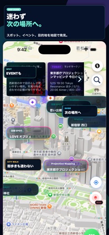
Every shipping app on the App Store has gone through the same decisions you're working through right now: which screenshot goes first, what caption sits over it, which device frame to show, what color the background should be. The 10 screenshots above are FlareSpot's answers to those questions — they're public, they're real, and they made it through Apple's review.
What the numbers say: FlareSpot runs a dark set where the background shifts from screenshot to screenshot (first shot #042C44) — each image has to stand on its own, so the captions carry more of the story. The accent colour we picked up, #54F4E4, is the one to reuse for badges, arrows and highlighted words if you borrow this look. Hit Use this style to open the editor with these exact colours and drop your own screenshot in.
Notice the first screenshot in particular. It's the one users see in search results and on the product page, and it's where most apps spend their best caption and tightest design. Look at the proportion of background to phone, where the text sits, what one thing the image is trying to communicate.
Want to see how other Lifestyle apps approach the same problem? Browse more Lifestyle apps in the showcase.
Take what works into your own screenshots
Open LaunchShots and design your App Store & Google Play screenshots — pick a device frame, drop captions, ship in minutes. Free, in your browser.
Open the screenshot editor →Apps with a similar look
Closest background + accent colours among the listings we've analysed — useful when you want to see the same palette handled by a different team.