Chart position — tracked daily by LaunchShots
Screenshot style breakdown
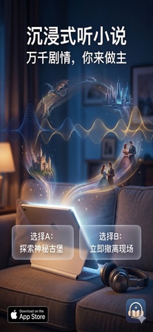
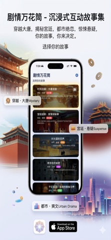
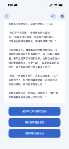
Sampled from 3 of 剧情万花筒's App Store screenshots — background, accent and theme, measured by LaunchShots (not something Apple publishes).
#0C1C2C bg
#2E3B49
#744C3C accent
#FFFFFF text
Screenshots
Icon palette
About this app
剧情万花筒 — 沉浸式互动文字冒险游戏 探索多条精彩剧情线,体验多结局分支的阅读乐趣。每一次选择都将改变故事的走向,让你成为故事的主角! 【核心特色】 海量原创剧情 - 古风仙侠、都市悬疑、宫廷权谋、科幻未来... 多种题材任你选择 - 每个故事都是精心打磨的完整世界,沉浸式体验让人欲罢不能 - 持续更新中,新故事源源不断 互动式玩法 - 关键节点做出选择,影响剧情走向和最终结局 - 多结局设计,每次重读都有新发现 - 轻松休闲,随时随地享受阅读乐趣 AI语音朗读系统 - TTS智能朗读,全自动语音合成,自然流畅的听剧体验 - 支持多种音色切换:温柔女声、磁性男声、可爱童声... - 后台持续播放,锁屏/切App不中断,真正解放双手 Apple Watch完美适配 - 手表端独立运行,无需手机也能阅读 - 优化的界面设计,小屏幕也有大体验 - 支持下载管理,离线畅读无压力 v2.0 重大升级 - 动态故事系统:API新增故事自动支持,无需更新App - 流畅体验:分页加载、智能缓存、零闪烁 - 存储管理:可视化下载列表、便捷删除功能 - 自动修复:智能扫描恢复丢失数据 立即…
App details
What you can learn from 剧情万花筒
Every shipping app on the App Store has gone through the same decisions you're working through right now: which screenshot goes first, what caption sits over it, which device frame to show, what color the background should be. The 3 screenshots above are 剧情万花筒's answers to those questions — they're public, they're real, and they made it through Apple's review.
What the numbers say: 剧情万花筒 runs a mixed light-and-dark set where the background shifts from screenshot to screenshot (first shot #0C1C2C) — each image has to stand on its own, so the captions carry more of the story. The accent colour we picked up, #744C3C, is the one to reuse for badges, arrows and highlighted words if you borrow this look. Hit Use this style to open the editor with these exact colours and drop your own screenshot in.
Notice the first screenshot in particular. It's the one users see in search results and on the product page, and it's where most apps spend their best caption and tightest design. Look at the proportion of background to phone, where the text sits, what one thing the image is trying to communicate.
Want to see how other Book apps approach the same problem? Browse more Book apps in the showcase.
Take what works into your own screenshots
Open LaunchShots and design your App Store & Google Play screenshots — pick a device frame, drop captions, ship in minutes. Free, in your browser.
Open the screenshot editor →Apps with a similar look
Closest background + accent colours among the listings we've analysed — useful when you want to see the same palette handled by a different team.