Chart position — tracked daily by LaunchShots
Screenshot style breakdown
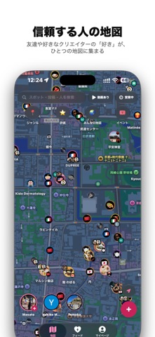
Sampled from 6 of Lovy's App Store screenshots — background, accent and theme, measured by LaunchShots (not something Apple publishes).
#FCFCFC bg
#DDDDDD
#344C64 accent
#111111 text
Reading the caption text from the screenshots in your browser…
Screenshots


Icon palette
About this app
食事、観光、ジム、ヨガ、コンサート、ショッピング。なんでもない帰り道。 Lovyは、現実世界の場所に紐づくあらゆる体験を簡単に記録し、クローズドなコミュニティで共有し、自分にとっての世界、自分もまだ知らなかった世界を、信頼できる友達と一緒に再発見・再構築することのできる新感覚・新時代のソーシャルマップです。 地図がピンで覆い尽くされている。 おすすめされたお店がチャットに埋もれてる。 桜舞い散る星の数はもう信じられない。 Lovyなら、信頼できる人の信頼できる情報だけを、AIが賢く分かりやすく整理した地図上で楽しく記録・共有・発見できます。 ■ 場所ごとに、体験をログに 評価、写真・動画、コメントをひとつのログにまとめられます。同じ場所を何度訪れても、その時々の記録を別のログとして残せて、いつ誰と来たかやその時の写真を簡単に見返せます。投稿後の編集、削除、スポットの変更にも対応しています。 ■ 場所と自分の関係性を整理して記録 行ったことがある場合には「大好き/好き/OK/イマイチ」。行ったことがない場合には「…
App details
What you can learn from Lovy
Every shipping app on the App Store has gone through the same decisions you're working through right now: which screenshot goes first, what caption sits over it, which device frame to show, what color the background should be. The 7 screenshots above are Lovy's answers to those questions — they're public, they're real, and they made it through Apple's review.
What the numbers say: Lovy runs a light set with one background colour (#FCFCFC) carried across every screenshot — the listing reads as a single poster when the shots sit side by side in search results. The accent colour we picked up, #344C64, is the one to reuse for badges, arrows and highlighted words if you borrow this look. Hit Use this style to open the editor with these exact colours and drop your own screenshot in.
Notice the first screenshot in particular. It's the one users see in search results and on the product page, and it's where most apps spend their best caption and tightest design. Look at the proportion of background to phone, where the text sits, what one thing the image is trying to communicate.
Want to see how other Travel apps approach the same problem? Browse more Travel apps in the showcase.
Take what works into your own screenshots
Open LaunchShots and design your App Store & Google Play screenshots — pick a device frame, drop captions, ship in minutes. Free, in your browser.
Open the screenshot editor →Apps with a similar look
Closest background + accent colours among the listings we've analysed — useful when you want to see the same palette handled by a different team.