Chart position — tracked daily by LaunchShots
Screenshot style breakdown
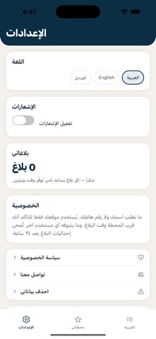
Sampled from 4 of جلكان's App Store screenshots — background, accent and theme, measured by LaunchShots (not something Apple publishes).
#FCFCFC bg
#DDDDDD
#0C2C4C accent
#111111 text
Screenshots


Icon palette
About this app
جلكان تطبيق مجتمعي مجاني لمدينة الموصل. يجيب عن سؤال واحد قبل أن تشغّل سيارتك: أي محطة تعمل الآن، وكم سيارة في طابورها؟ المعلومة تأتي من الناس أنفسهم — من سائق كان واقفاً في الطابور قبل دقائق — ومع كل محطة يظهر متى تم التأكد من حالتها آخر مرة. لأن معلومة عمرها ساعتان ليست معلومة. ماذا يعرض التطبيق • حالة كل محطة: مفتوحة أو مغلقة • طول الطابور بعدد السيارات • نوع البنزين المتوفر: عادي، محسّن، أو سوبر • الوقت المتوقع للانتظار • المسافة من موقعك، والمحطات مرتّبة من الأقرب • مدى الثقة بالمعلومة، ومتى تم تأكيدها آخر مرة التبليغ بضغطتين من شاشة المحطة اضغط «مفتوحة» أو «مغلقة»، وإذا كانت مفتوحة اختر عدد السيارات بالطابور. وإن أردت، تقدر تضيف نوع البنزين أو ملاحظة. ويمكن لأي مستخدم تأكيد بلاغ غيره أو الإشارة إلى أنه لم يعد صحيحاً. لماذا يمكن الوثوق به • لا يُقبل البلاغ إلا من قرب المحطة — لا يستطيع شخص بعيد تغيير حالة محطة لم يرها • تتقادم البلاغات تلقائياً، فلا تبقى معلومة قديمة معروضة وك…
App details
What you can learn from جلكان
Every shipping app on the App Store has gone through the same decisions you're working through right now: which screenshot goes first, what caption sits over it, which device frame to show, what color the background should be. The 4 screenshots above are جلكان's answers to those questions — they're public, they're real, and they made it through Apple's review.
What the numbers say: جلكان runs a light set with one background colour (#FCFCFC) carried across every screenshot — the listing reads as a single poster when the shots sit side by side in search results. The accent colour we picked up, #0C2C4C, is the one to reuse for badges, arrows and highlighted words if you borrow this look. Hit Use this style to open the editor with these exact colours and drop your own screenshot in.
Notice the first screenshot in particular. It's the one users see in search results and on the product page, and it's where most apps spend their best caption and tightest design. Look at the proportion of background to phone, where the text sits, what one thing the image is trying to communicate.
Want to see how other Travel apps approach the same problem? Browse more Travel apps in the showcase.
Take what works into your own screenshots
Open LaunchShots and design your App Store & Google Play screenshots — pick a device frame, drop captions, ship in minutes. Free, in your browser.
Open the screenshot editor →Apps with a similar look
Closest background + accent colours among the listings we've analysed — useful when you want to see the same palette handled by a different team.