Chart position — tracked daily by LaunchShots
Screenshot changes — detected by LaunchShots
Screenshot style breakdown
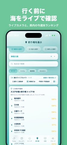
Sampled from 5 of 魚スイッチ - 釣り天気予報&釣行プラン's App Store screenshots — background, accent and theme, measured by LaunchShots (not something Apple publishes).
#2CACB4 bg
#26979E
#84CCC4 accent
#111111 text
Screenshots



Icon palette
About this app
▼ App Store 天気カテゴリTop10入り実績!海の「今」と「釣れる時間」がわかる釣りアプリ 釣り場の海をライブカメラで確認して、潮汐×天気×シーズンから釣れやすさを%で予測。 みんなの匿名の釣果から、その釣り場でいま何が何時ごろ釣れているかも見られます。 潮汐×気象×シーズン×あなたの実績から、釣れる場所・日・時間帯がひと目でわかる。 魚スイッチは、潮汐・天気・時間帯・魚種ごとの傾向をもとに、釣りに行くタイミングを考えやすくする釣行サポートアプリです。海に面した全国39都道府県・1,400スポットに対応し、地点は順次追加中です。 今日の釣れやすさをスコアやグラフで確認できるので、出発前の判断や、よく行く釣り場の比較に役立ちます。初心者の方でも「いつ行けばよさそうか」をひと目でつかみやすく、週末の予定づくりから釣行記録まで、これひとつで管理できます。 主な機能 ・海のライブカメラ:釣り場近くのライブ映像で、波や混み具合を出発前に確認 ・みんなの釣果:匿名で集まった釣果から、その釣り場で釣れている魚と時間帯がわか…
App details
What you can learn from 魚スイッチ - 釣り天気予報&釣行プラン
Every shipping app on the App Store has gone through the same decisions you're working through right now: which screenshot goes first, what caption sits over it, which device frame to show, what color the background should be. The 5 screenshots above are 魚スイッチ - 釣り天気予報&釣行プラン's answers to those questions — they're public, they're real, and they made it through Apple's review.
What the numbers say: 魚スイッチ - 釣り天気予報&釣行プラン runs a mixed light-and-dark set where the background shifts from screenshot to screenshot (first shot #2CACB4) — each image has to stand on its own, so the captions carry more of the story. The accent colour we picked up, #84CCC4, is the one to reuse for badges, arrows and highlighted words if you borrow this look. Hit Use this style to open the editor with these exact colours and drop your own screenshot in.
Notice the first screenshot in particular. It's the one users see in search results and on the product page, and it's where most apps spend their best caption and tightest design. Look at the proportion of background to phone, where the text sits, what one thing the image is trying to communicate.
Want to see how other Weather apps approach the same problem? Browse more Weather apps in the showcase.
Take what works into your own screenshots
Open LaunchShots and design your App Store & Google Play screenshots — pick a device frame, drop captions, ship in minutes. Free, in your browser.
Open the screenshot editor →Apps with a similar look
Closest background + accent colours among the listings we've analysed — useful when you want to see the same palette handled by a different team.