Screenshot changes — detected by LaunchShots
Screenshot style breakdown
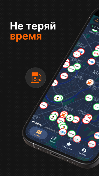
Sampled from 5 of Бензокарта's App Store screenshots — background, accent and theme, measured by LaunchShots (not something Apple publishes).
#141414 bg
#343434
#FC6404 accent
#FFFFFF text
Reading the caption text from the screenshots in your browser…
Screenshots


Icon palette
About this app
Бензокарта — карта автозаправок всей России, которая показывает, где прямо сейчас есть топливо. Бензокарта собирает отметки водителей и открытые данные, чтобы вы видели реальную ситуацию: где есть бензин и дизель, какая загруженность очереди и когда обновлялась информация. ЧТО УМЕЕТ ПРИЛОЖЕНИЕ • Карта всех АЗС России с фильтром по виду топлива • Список ближайших заправок, отсортированный по расстоянию • Статус наличия топлива: есть / ограниченно / нет • Загруженность очереди и время последнего обновления • Маршрут до выбранной АЗС в один тап • Поиск по региону, если планируете поездку СООБЩЕСТВО ВОДИТЕЛЕЙ Информация точнее, когда её обновляют сами водители. Отметьте ситуацию на заправке, где только что были, — это займёт пару секунд и поможет другим. Не нашли нужную АЗС на карте? Отправьте заявку, и после проверки она появится. ПРОСТО И ЧЕСТНО • Бесплатно • Без рекламы и трекеров • …
App details
What you can learn from Бензокарта
Every shipping app on the App Store has gone through the same decisions you're working through right now: which screenshot goes first, what caption sits over it, which device frame to show, what color the background should be. The 5 screenshots above are Бензокарта's answers to those questions — they're public, they're real, and they made it through Apple's review.
What the numbers say: Бензокарта runs a dark set with one background colour (#141414) carried across every screenshot — the listing reads as a single poster when the shots sit side by side in search results. The accent colour we picked up, #FC6404, is the one to reuse for badges, arrows and highlighted words if you borrow this look. Hit Use this style to open the editor with these exact colours and drop your own screenshot in.
Notice the first screenshot in particular. It's the one users see in search results and on the product page, and it's where most apps spend their best caption and tightest design. Look at the proportion of background to phone, where the text sits, what one thing the image is trying to communicate.
Want to see how other Navigation apps approach the same problem? Browse more Navigation apps in the showcase.
Take what works into your own screenshots
Open LaunchShots and design your App Store & Google Play screenshots — pick a device frame, drop captions, ship in minutes. Free, in your browser.
Open the screenshot editor →Apps with a similar look
Closest background + accent colours among the listings we've analysed — useful when you want to see the same palette handled by a different team.