Chart position — tracked daily by LaunchShots
Screenshot changes — detected by LaunchShots
Screenshot style breakdown
Sampled from 6 of hYYa ink: Markdown & JSON's App Store screenshots — background, accent and theme, measured by LaunchShots (not something Apple publishes).
#040C14 bg
#272E34
#F4B44C accent
#FFFFFF text
Reading the caption text from the screenshots in your browser…
Screenshots


iPad screenshots




Icon palette
About this app
Stop met syntax lezen. Begin met documenten lezen. Een .md-bestand. Een JSON-export. Een Jupyter-notebook, een diagram, een contract om te ondertekenen. hYYa ink opent ze als heldere, leesbare documenten in plaats van muren van ruwe tekst, op je Mac, iPhone, iPad en Apple Vision Pro. Lezen is gratis, voor altijd. LEES WAT JE TOEGESTUURD KRIJGT • Markdown — nette koppen, lijsten, tabellen en links • JSON, YAML en TOML — overzichtelijke boomstructuren om in en uit te klappen en te verkennen • CSV en TSV — een echte tabel, geen muur van komma's • Mermaid en Graphviz — diagrammen die meteen worden getekend, offline • LaTeX — wiskunde die er goed uitziet • Jupyter-notebooks — cellen, code en tekstuitvoer, prettig leesbaar • AsciiDoc, Org-mode, XML, diffs en logs — eindelijk leesbaar PAS HET AAN WAAR JE HET ZIET Wijzig een JSON-waarde of een tabelcel direct op de pagina, en alleen dat v…
App details
What you can learn from hYYa ink: Markdown & JSON
Every shipping app on the App Store has gone through the same decisions you're working through right now: which screenshot goes first, what caption sits over it, which device frame to show, what color the background should be. The 19 screenshots above are hYYa ink: Markdown & JSON's answers to those questions — they're public, they're real, and they made it through Apple's review.
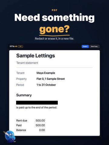
What the numbers say: hYYa ink: Markdown & JSON runs a dark set with one background colour (#040C14) carried across every screenshot — the listing reads as a single poster when the shots sit side by side in search results. The accent colour we picked up, #F4B44C, is the one to reuse for badges, arrows and highlighted words if you borrow this look. Hit Use this style to open the editor with these exact colours and drop your own screenshot in.
Notice the first screenshot in particular. It's the one users see in search results and on the product page, and it's where most apps spend their best caption and tightest design. Look at the proportion of background to phone, where the text sits, what one thing the image is trying to communicate.
Want to see how other Developer Tools apps approach the same problem? Browse more Developer Tools apps in the showcase.
Take what works into your own screenshots
Open LaunchShots and design your App Store & Google Play screenshots — pick a device frame, drop captions, ship in minutes. Free, in your browser.
Open the screenshot editor →Apps with a similar look
Closest background + accent colours among the listings we've analysed — useful when you want to see the same palette handled by a different team.