Screenshot changes — detected by LaunchShots
Screenshot style breakdown
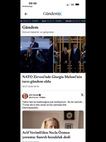
Sampled from 5 of Gündemix's App Store screenshots — background, accent and theme, measured by LaunchShots (not something Apple publishes).
#FCFCFC bg
#DDDDDD
#C40414 accent
#111111 text
Reading the caption text from the screenshots in your browser…
Screenshots
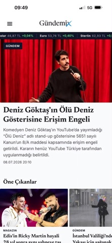
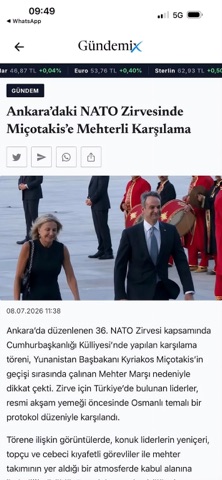
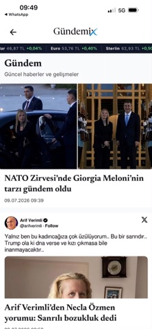

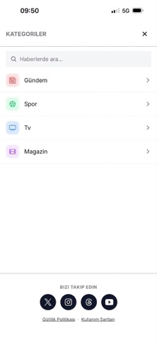
iPad screenshots


Icon palette
About this app
Gündemix — Gündemin hızını, sosyal medyanın nabzını ve öne çıkan haberleri tek akışta yakala. Türkiye'nin nabzını tutan tüm haberleri hızlı, temiz ve kesintisiz bir okuma deneyimiyle telefonunda topla. Son dakika gelişmelerinden magazin ve spor dünyasına, ekonomi verilerinden teknoloji haberlerine kadar ilgilendiğin her şey tek bir uygulamada. NEDEN GÜNDEMİX? • Tek akışta tüm gündem — Öne çıkan haberler, kategori bölümleri ve sosyal medyanın en çok konuşulan içerikleri düzenli bir akışta. • Anlık bildirimler — Önemli gelişmeler ve son dakika haberleri yayınlanır yayınlanmaz haberdar ol. Bildirime dokun, doğrudan habere ulaş. • Canlı piyasa verileri — Döviz, altın, borsa ve piyasa verileri anlık güncellenir; üst şeritte akıcı bir bantla takip et. • Hızlı arama — Kelime, konu veya etiketle saniyeler içinde aradığın habere ulaş. • Kategoriler — Gündem, spor, magazin, tv, ekonomi, dünya,…
App details
What you can learn from Gündemix
Every shipping app on the App Store has gone through the same decisions you're working through right now: which screenshot goes first, what caption sits over it, which device frame to show, what color the background should be. The 10 screenshots above are Gündemix's answers to those questions — they're public, they're real, and they made it through Apple's review.
What the numbers say: Gündemix runs a light set with one background colour (#FCFCFC) carried across every screenshot — the listing reads as a single poster when the shots sit side by side in search results. The accent colour we picked up, #C40414, is the one to reuse for badges, arrows and highlighted words if you borrow this look. Hit Use this style to open the editor with these exact colours and drop your own screenshot in.
Notice the first screenshot in particular. It's the one users see in search results and on the product page, and it's where most apps spend their best caption and tightest design. Look at the proportion of background to phone, where the text sits, what one thing the image is trying to communicate.
Want to see how other News apps approach the same problem? Browse more News apps in the showcase.
Take what works into your own screenshots
Open LaunchShots and design your App Store & Google Play screenshots — pick a device frame, drop captions, ship in minutes. Free, in your browser.
Open the screenshot editor →Apps with a similar look
Closest background + accent colours among the listings we've analysed — useful when you want to see the same palette handled by a different team.