Chart position — tracked daily by LaunchShots
Screenshot style breakdown
Sampled from 6 of Deuceo's App Store screenshots — background, accent and theme, measured by LaunchShots (not something Apple publishes).
#ECECE4 bg
#CFCFC8
#645C34 accent
#111111 text
Reading the caption text from the screenshots in your browser…
Screenshots

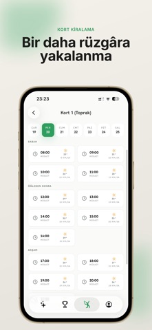

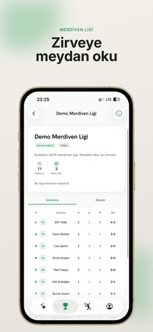


Icon palette
About this app
Deuceo, tenis kulübünü tek bir uygulamadan yönetmenin en kolay yolu. Kort rezervasyonundan turnuva fikstürüne, ders programından kulüp içi sosyal akışa kadar her şey bir arada. KULÜP YÖNETİMİ • İhtiyacın kadar üye, koç ve kort • Üye rolleri: yönetici, antrenör, ön büro • Kort takvimi, ders programı ve rezervasyonlar • Kredi cüzdanı ve ödeme takibi • Kulüp duyuruları ve raporlama TURNUVA VE LİG • Eleme, round robin ve grup aşamalı turnuvalar; otomatik kura ve fikstür • Merdiven usulü ligler: meydan oku, kazan, sıralamada yüksel • ELO tabanlı sıralama: her maç sıralamanı etkiler • Maç teklifi gönder, sonucu gir, rakibin onaylasın DEUCEO GENEL AĞI • Her oyuncu otomatik olarak Deuceo genel ağına katılır • Farklı kulüplerden oyuncularla tanış, maç teklifi at • Genel ağ turnuvalarına ve liglerine kredinle katıl • Kulüpler arasında tek dokunuşla geçiş yap SOSYAL AKIŞ • Maç sonuçlarını ve f…
App details
What you can learn from Deuceo
Every shipping app on the App Store has gone through the same decisions you're working through right now: which screenshot goes first, what caption sits over it, which device frame to show, what color the background should be. The 6 screenshots above are Deuceo's answers to those questions — they're public, they're real, and they made it through Apple's review.
What the numbers say: Deuceo runs a mixed light-and-dark set where the background shifts from screenshot to screenshot (first shot #ECECE4) — each image has to stand on its own, so the captions carry more of the story. The accent colour we picked up, #645C34, is the one to reuse for badges, arrows and highlighted words if you borrow this look. Hit Use this style to open the editor with these exact colours and drop your own screenshot in.
Notice the first screenshot in particular. It's the one users see in search results and on the product page, and it's where most apps spend their best caption and tightest design. Look at the proportion of background to phone, where the text sits, what one thing the image is trying to communicate.
Want to see how other Sports apps approach the same problem? Browse more Sports apps in the showcase.
Take what works into your own screenshots
Open LaunchShots and design your App Store & Google Play screenshots — pick a device frame, drop captions, ship in minutes. Free, in your browser.
Open the screenshot editor →Apps with a similar look
Closest background + accent colours among the listings we've analysed — useful when you want to see the same palette handled by a different team.