Chart position — tracked daily by LaunchShots
Screenshot style breakdown
Sampled from 5 of Тимофеевна - сад и огород's App Store screenshots — background, accent and theme, measured by LaunchShots (not something Apple publishes).
#FCFCFC bg
#DDDDDD
#544CFC accent
#111111 text
Screenshots
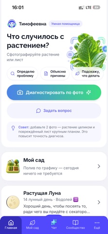
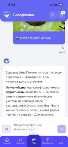
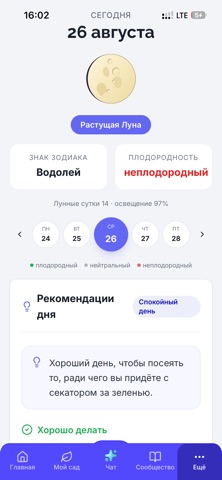
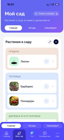
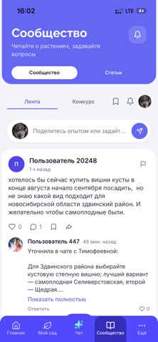
iPad screenshots


Icon palette
About this app
Тимофеевна - умная помощница для сада, огорода и комнатных растений. Как соседка по участку, которая знает про растения всё и всегда готова подсказать. Бесплатно, без рекламы и платных подписок. ОПРЕДЕЛИТ БОЛЕЗНЬ ПО ФОТОГРАФИИ Сфотографируйте пожелтевший лист, пятна на плодах или увядающий побег - Тимофеевна разберётся, что происходит с растением, и объяснит, чем помочь. В рекомендациях по препаратам она опирается на Государственный каталог пестицидов и агрохимикатов: никаких средств «на глазок» и произвольных доз. ОТВЕТИТ НА ЛЮБОЙ ВОПРОС ПРО РАСТЕНИЯ Когда сеять перец на рассаду. Почему не завязываются огурцы. Чем подкормить розы осенью. Что делать с ведром кабачков. Спрашивайте своими словами - Тимофеевна отвечает по-человечески, с учётом вашего региона и того, что растёт именно у вас. МОЙ САД Заведите свои грядки, теплицы, деревья и кустарники. Тимофеевна запомнит, что и когда …
App details
What you can learn from Тимофеевна - сад и огород
Every shipping app on the App Store has gone through the same decisions you're working through right now: which screenshot goes first, what caption sits over it, which device frame to show, what color the background should be. The 9 screenshots above are Тимофеевна - сад и огород's answers to those questions — they're public, they're real, and they made it through Apple's review.
What the numbers say: Тимофеевна - сад и огород runs a mixed light-and-dark set where the background shifts from screenshot to screenshot (first shot #FCFCFC) — each image has to stand on its own, so the captions carry more of the story. The accent colour we picked up, #544CFC, is the one to reuse for badges, arrows and highlighted words if you borrow this look. Hit Use this style to open the editor with these exact colours and drop your own screenshot in.
Notice the first screenshot in particular. It's the one users see in search results and on the product page, and it's where most apps spend their best caption and tightest design. Look at the proportion of background to phone, where the text sits, what one thing the image is trying to communicate.
Want to see how other Reference apps approach the same problem? Browse more Reference apps in the showcase.
Take what works into your own screenshots
Open LaunchShots and design your App Store & Google Play screenshots — pick a device frame, drop captions, ship in minutes. Free, in your browser.
Open the screenshot editor →Apps with a similar look
Closest background + accent colours among the listings we've analysed — useful when you want to see the same palette handled by a different team.