Chart position — tracked daily by LaunchShots
Screenshot style breakdown
Sampled from 6 of WayTrek's App Store screenshots — background, accent and theme, measured by LaunchShots (not something Apple publishes).
#2C3C4C bg
#495765
#5CA4BC accent
#FFFFFF text
Screenshots



Icon palette
About this app
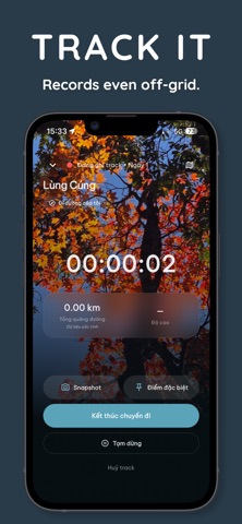
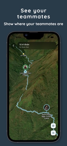
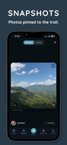
WayTrek là bạn đồng hành cho những chuyến trekking ở Việt Nam — từ chọn cung, trong hành trình, đến khi trở về và kể lại chuyến đi. Ứng dụng được xây dựng cho điều kiện của núi rừng: dốc, lạnh, và không có sóng. KHÂU CHUẨN BỊ • Thư viện cung đường Việt Nam với quãng đường, tổng leo dốc, độ cao đỉnh và mô tả thực tế. • Địa hình 3D dựng từ dữ liệu độ cao — nhìn thấy sống núi và độ dốc trước khi đặt chân tới. • Tải cung về máy: bản đồ 2D và khối địa hình 3D dùng được trọn vẹn khi mất sóng. TRÊN ĐƯỜNG TREK • Ghi track GPS liên tục — bỏ điện thoại vào túi, khoá màn hình, hành trình vẫn được ghi. Quãng đường, thời gian và độ cao hiện ngay trên màn khoá. • Dẫn đường theo tuyến, cảnh báo khi đi lệch. • Điểm đặc biệt dọc cung: lán nghỉ, nguồn nước, ngã ba dễ lạc — và bạn đề xuất thêm được điểm mới cho người đi sau. • Chụp ảnh gắn đúng toạ độ nơi bạn đứng, kể cả khi không có mạng. • Gặp một loà…
App details
What you can learn from WayTrek
Every shipping app on the App Store has gone through the same decisions you're working through right now: which screenshot goes first, what caption sits over it, which device frame to show, what color the background should be. The 6 screenshots above are WayTrek's answers to those questions — they're public, they're real, and they made it through Apple's review.
What the numbers say: WayTrek runs a dark set with one background colour (#2C3C4C) carried across every screenshot — the listing reads as a single poster when the shots sit side by side in search results. The accent colour we picked up, #5CA4BC, is the one to reuse for badges, arrows and highlighted words if you borrow this look. Hit Use this style to open the editor with these exact colours and drop your own screenshot in.
Notice the first screenshot in particular. It's the one users see in search results and on the product page, and it's where most apps spend their best caption and tightest design. Look at the proportion of background to phone, where the text sits, what one thing the image is trying to communicate.
Want to see how other Navigation apps approach the same problem? Browse more Navigation apps in the showcase.
Take what works into your own screenshots
Open LaunchShots and design your App Store & Google Play screenshots — pick a device frame, drop captions, ship in minutes. Free, in your browser.
Open the screenshot editor →Apps with a similar look
Closest background + accent colours among the listings we've analysed — useful when you want to see the same palette handled by a different team.