Screenshot style breakdown
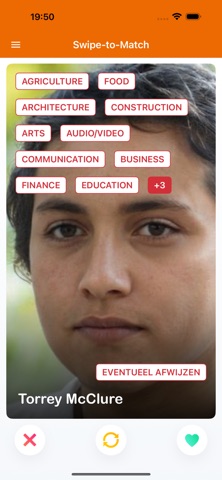
Sampled from 6 of Dag van de Nederlandse Cloud's App Store screenshots — background, accent and theme, measured by LaunchShots (not something Apple publishes).
#FC6C04 bg
#FC8027
#FCA45C accent
#FFFFFF text
Screenshots
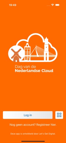

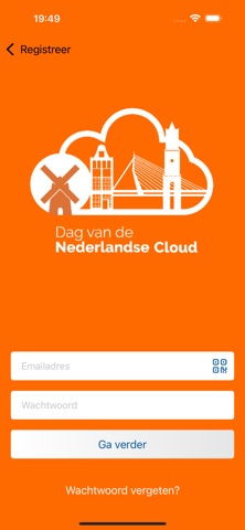

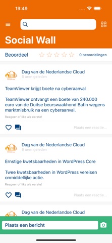
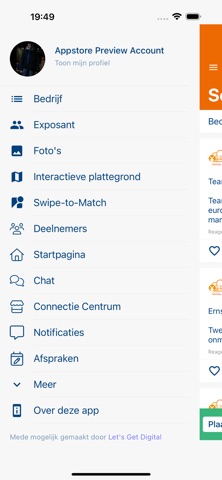


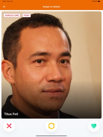
iPad screenshots


Icon palette
About this app
De officiële Dag van de Nederlandse Cloud app geeft je naadloze toegang tot Social Wall, Attendees, Chat, Connect, Swipe and Match en Exhibitors functionaliteit om je gedurende het evenement verbonden en betrokken te houden. Dag van de Nederlandse Cloud 2026 De officiële event-app van de Dag van de Nederlandse Cloud. Ontdek het programma, stel je persoonlijke agenda samen en blijf op de hoogte van alle activiteiten tijdens het evenement. Met de app kun je: • Het volledige programma bekijken • Je eigen agenda samenstellen • Sprekers, partners en deelnemers ontdekken • Netwerken via chat, connect en matchmaking • Realtime updates en belangrijke meldingen ontvangen • De Social Wall volgen en deelnemen aan discussies De Dag van de Nederlandse Cloud brengt professionals uit Cloud, IT en Cybersecurity samen voor een middag en avond vol inspiratie, kennisdeling en waardevolle ontmoetingen…
App details
What you can learn from Dag van de Nederlandse Cloud
Every shipping app on the App Store has gone through the same decisions you're working through right now: which screenshot goes first, what caption sits over it, which device frame to show, what color the background should be. The 20 screenshots above are Dag van de Nederlandse Cloud's answers to those questions — they're public, they're real, and they made it through Apple's review.
What the numbers say: Dag van de Nederlandse Cloud runs a mixed light-and-dark set where the background shifts from screenshot to screenshot (first shot #FC6C04) — each image has to stand on its own, so the captions carry more of the story. The accent colour we picked up, #FCA45C, is the one to reuse for badges, arrows and highlighted words if you borrow this look. Hit Use this style to open the editor with these exact colours and drop your own screenshot in.
Notice the first screenshot in particular. It's the one users see in search results and on the product page, and it's where most apps spend their best caption and tightest design. Look at the proportion of background to phone, where the text sits, what one thing the image is trying to communicate.
Want to see how other Social Networking apps approach the same problem? Browse more Social Networking apps in the showcase.
Take what works into your own screenshots
Open LaunchShots and design your App Store & Google Play screenshots — pick a device frame, drop captions, ship in minutes. Free, in your browser.
Open the screenshot editor →Apps with a similar look
Closest background + accent colours among the listings we've analysed — useful when you want to see the same palette handled by a different team.