Screenshot style breakdown
Sampled from 3 of Phase One's App Store screenshots — background, accent and theme, measured by LaunchShots (not something Apple publishes).
#142C4C bg
#344965
#A49464 accent
#FFFFFF text
Screenshots
Icon palette
About this app
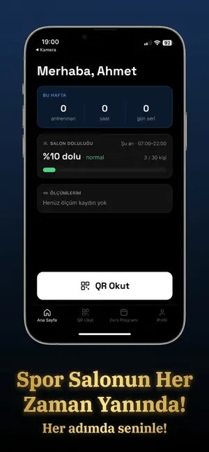
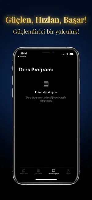
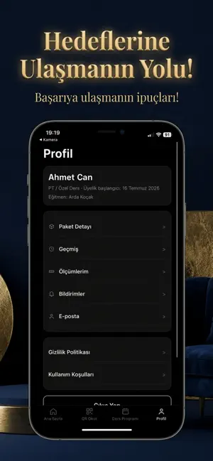
Phase One Gym Studio'nun resmî mobil uygulaması — üyelik deneyimini cebine taşır. NOT: Bu uygulama Phase One Gym Studio üyelerine özeldir. Giriş için şifre gerekmez; salona kayıtlı telefon numaranıza SMS ile gelen tek kullanımlık kod yeterlidir. QR İLE GİRİŞ-ÇIKIŞ Resepsiyonda beklemeden telefonunla QR kodu okut, salona saniyeler içinde giriş yap. ANLIK DOLULUK Salonun o anki doluluğunu evden kontrol et, antrenmanını en sakin saate planla. DERS PROGRAMI Haftalık ders programını incele, derslere kaydol, yaklaşan derslerini tek ekrandan takip et. ÖLÇÜM VE GELİŞİM TAKİBİ Salonda yapılan kilo ve vücut ölçümlerin uygulamaya işlenir; gelişimini grafiklerle izle. ÜYELİK BİLGİLERİ Üyelik durumun ve bitiş tarihin her an elinin altında. BİLDİRİMLER Ders hatırlatmaları ve salonla ilgili duyurular anında telefonunda. GEÇMİŞ Tüm giriş-çıkış kayıtlarını dilediğin zaman görüntüle.
App details
What you can learn from Phase One
Every shipping app on the App Store has gone through the same decisions you're working through right now: which screenshot goes first, what caption sits over it, which device frame to show, what color the background should be. The 3 screenshots above are Phase One's answers to those questions — they're public, they're real, and they made it through Apple's review.
What the numbers say: Phase One runs a dark set where the background shifts from screenshot to screenshot (first shot #142C4C) — each image has to stand on its own, so the captions carry more of the story. The accent colour we picked up, #A49464, is the one to reuse for badges, arrows and highlighted words if you borrow this look. Hit Use this style to open the editor with these exact colours and drop your own screenshot in.
Notice the first screenshot in particular. It's the one users see in search results and on the product page, and it's where most apps spend their best caption and tightest design. Look at the proportion of background to phone, where the text sits, what one thing the image is trying to communicate.
Want to see how other Sports apps approach the same problem? Browse more Sports apps in the showcase.
Take what works into your own screenshots
Open LaunchShots and design your App Store & Google Play screenshots — pick a device frame, drop captions, ship in minutes. Free, in your browser.
Open the screenshot editor →Apps with a similar look
Closest background + accent colours among the listings we've analysed — useful when you want to see the same palette handled by a different team.