Chart position — tracked daily by LaunchShots
Screenshot style breakdown
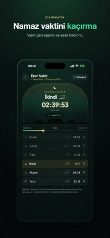
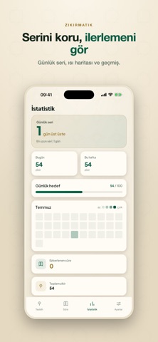
Sampled from 6 of Zikirmatik: Tesbih & Kur'an's App Store screenshots — background, accent and theme, measured by LaunchShots (not something Apple publishes).
#040C0C bg
#272E2E
#2CAC7C accent
#FFFFFF text
Screenshots




Icon palette
About this app
Zikirmatik; günlük zikirlerini takip etmen ve Kur'an-ı Kerim sûrelerini ezberlemen için tasarlanmış, sade ve zarif bir dijital tesbih uygulamasıdır. İnternet olmadan da tam işlevle çalışır — hesap açman gerekmez. Dijital Tesbih & Zikir Sayacı • Dokunarak say; titreşim ve tur tamamlama geri bildirimi • Hazır zikirler (Sübhânallah, Elhamdülillah, Allahu Ekber…) ve kendi özel zikirlerin • Günlük ve toplam sayımlar, hedef belirleme • Otomatik tur ilerleme Kur'an Ezber (Ezber Modu) • 114 sûre, 6236 âyet — Arapça (Uthmani hat), Türkçe meal ve okunuş, tamamen çevrimdışı • Kelime kelime veya âyet âyet "aç-gizle" ezber modu • Âyet ve sûre bazında ilerleme takibi • Sesli okuma: çal/duraklat, tekrar, A-B tekrarı, kâri seçimi • Sûre sesini indir, çevrimdışı dinle Namaz Vakitleri • Bulunduğun şehre göre vakitler ve vakit bildirimleri İstatistik & Alışkanlık • Günlük seri (streak), ısı haritası, …
App details
What you can learn from Zikirmatik: Tesbih & Kur'an
Every shipping app on the App Store has gone through the same decisions you're working through right now: which screenshot goes first, what caption sits over it, which device frame to show, what color the background should be. The 10 screenshots above are Zikirmatik: Tesbih & Kur'an's answers to those questions — they're public, they're real, and they made it through Apple's review.
What the numbers say: Zikirmatik: Tesbih & Kur'an runs a mixed light-and-dark set where the background shifts from screenshot to screenshot (first shot #040C0C) — each image has to stand on its own, so the captions carry more of the story. The accent colour we picked up, #2CAC7C, is the one to reuse for badges, arrows and highlighted words if you borrow this look. Hit Use this style to open the editor with these exact colours and drop your own screenshot in.
Notice the first screenshot in particular. It's the one users see in search results and on the product page, and it's where most apps spend their best caption and tightest design. Look at the proportion of background to phone, where the text sits, what one thing the image is trying to communicate.
Want to see how other Reference apps approach the same problem? Browse more Reference apps in the showcase.
Take what works into your own screenshots
Open LaunchShots and design your App Store & Google Play screenshots — pick a device frame, drop captions, ship in minutes. Free, in your browser.
Open the screenshot editor →Apps with a similar look
Closest background + accent colours among the listings we've analysed — useful when you want to see the same palette handled by a different team.