Chart position — tracked daily by LaunchShots
Screenshot changes — detected by LaunchShots
Screenshot style breakdown
Sampled from 6 of Nöro KPSS's App Store screenshots — background, accent and theme, measured by LaunchShots (not something Apple publishes).
#04040C bg
#27272E
#344C9C accent
#FFFFFF text
Reading the caption text from the screenshots in your browser…
Screenshots





Icon palette
About this app
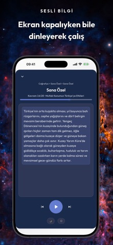
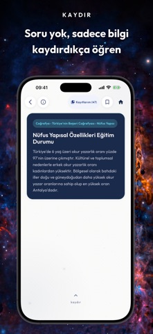
Sınava sayılı gün kaldığında en çok yıpratan şey, ne kadar hazır olduğunu bilmemektir. Nöro KPSS bunu somut hale getirir: 20.000+ soru, 1.204 kavram anlatımı ve her sorunun altında yazılı çözüm — hepsi uygulamayla birlikte cihazına kurulur. ÇEVRİMDIŞI ÇALIŞIR, HESAP İSTEMEZ Tüm sorular, anlatımlar ve haritalar cihazında paketli gelir. Metroda, serviste, sinyalin çekmediği yerde çalışır. Soru çözmek internet gerektirmez; internet reklam, satın alma ve dış bağlantılarda kullanılır. Kayıt ekranı yoktur; e-posta veya şifre istenmez. Uygulamayı aç, çözmeye başla. İÇERİK • 20.000+ soru — Tarih 14.143 · Coğrafya 3.768 · Vatandaşlık 2.177 · Güncel Bilgiler 1.346 • 4 ders → 47 ana konu → 222 konu → 1.204 kavram • Soruların tamamında yazılı çözüm açıklaması • 1.438 harita ve görsel destekli soru • 1.204 kavramın her biri için 4 bölümlü anlatım: Büyük Resim · Kavram Ağı · ÖSYM Tuzağı · Hafıza Çi…
App details
What you can learn from Nöro KPSS
Every shipping app on the App Store has gone through the same decisions you're working through right now: which screenshot goes first, what caption sits over it, which device frame to show, what color the background should be. The 10 screenshots above are Nöro KPSS's answers to those questions — they're public, they're real, and they made it through Apple's review.
What the numbers say: Nöro KPSS runs a dark set with one background colour (#04040C) carried across every screenshot — the listing reads as a single poster when the shots sit side by side in search results. The accent colour we picked up, #344C9C, is the one to reuse for badges, arrows and highlighted words if you borrow this look. Hit Use this style to open the editor with these exact colours and drop your own screenshot in.
Notice the first screenshot in particular. It's the one users see in search results and on the product page, and it's where most apps spend their best caption and tightest design. Look at the proportion of background to phone, where the text sits, what one thing the image is trying to communicate.
Want to see how other Education apps approach the same problem? Browse more Education apps in the showcase.
Take what works into your own screenshots
Open LaunchShots and design your App Store & Google Play screenshots — pick a device frame, drop captions, ship in minutes. Free, in your browser.
Open the screenshot editor →Apps with a similar look
Closest background + accent colours among the listings we've analysed — useful when you want to see the same palette handled by a different team.