Chart position — tracked daily by LaunchShots
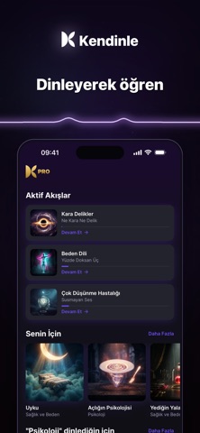
Screenshot style breakdown
Sampled from 6 of Kendinle: Kişisel Gelişim's App Store screenshots — background, accent and theme, measured by LaunchShots (not something Apple publishes).
#0C0414 bg
#2E2734
#3C2C5C accent
#FFFFFF text
Reading the caption text from the screenshots in your browser…
Screenshots


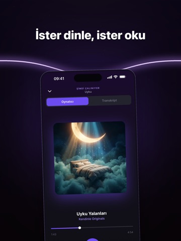
iPad screenshots



Icon palette
About this app
Kendinle, kişisel gelişimden psikolojiye, felsefeden tarihe, bilimden kariyer ve finansa uzanan 1000+ Türkçe sesli bölümle her gün yeni bir şey öğrenmeni sağlayan sesli öğrenme uygulamasıdır. Yolda, yürürken, spor yaparken ya da uyumadan önce kısa bölümlerle kendine zaman ayır. Podcast rahatlığında dinle; bir konuyu yüzeyde bırakmak yerine, birbiriyle bağlantılı bölümlerden oluşan akışlarla adım adım ilerle. KENDİNLE’DE NELER VAR? • 12 kategoride 1000+ Türkçe sesli bölüm • Kişisel Gelişim, Psikoloji, Felsefe, Tarih, Bilim ve Doğa • Teknoloji ve Gelecek, Kariyer ve İş, Para ve Finans • İlişkiler ve İletişim, Sağlık ve Beden, Yaşam Tarzı, Hobi ve Merak • Kısa kişilik analiziyle ilgi alanlarına göre kişiselleştirilmiş öneriler • Dinledikçe gelişen Koza ve koleksiyonuna ekleyebileceğin kelebekler • İçgörüler ile önemli fikirleri tek dokunuşla kaydetme • Transkript ile ister dinleme ister…
App details
What you can learn from Kendinle: Kişisel Gelişim
Every shipping app on the App Store has gone through the same decisions you're working through right now: which screenshot goes first, what caption sits over it, which device frame to show, what color the background should be. The 14 screenshots above are Kendinle: Kişisel Gelişim's answers to those questions — they're public, they're real, and they made it through Apple's review.
What the numbers say: Kendinle: Kişisel Gelişim runs a dark set with one background colour (#0C0414) carried across every screenshot — the listing reads as a single poster when the shots sit side by side in search results. The accent colour we picked up, #3C2C5C, is the one to reuse for badges, arrows and highlighted words if you borrow this look. Hit Use this style to open the editor with these exact colours and drop your own screenshot in.
Notice the first screenshot in particular. It's the one users see in search results and on the product page, and it's where most apps spend their best caption and tightest design. Look at the proportion of background to phone, where the text sits, what one thing the image is trying to communicate.
Want to see how other Education apps approach the same problem? Browse more Education apps in the showcase.
Take what works into your own screenshots
Open LaunchShots and design your App Store & Google Play screenshots — pick a device frame, drop captions, ship in minutes. Free, in your browser.
Open the screenshot editor →Apps with a similar look
Closest background + accent colours among the listings we've analysed — useful when you want to see the same palette handled by a different team.