Chart position — tracked daily by LaunchShots
Screenshot style breakdown
Sampled from 6 of Tadry's App Store screenshots — background, accent and theme, measured by LaunchShots (not something Apple publishes).
#0C0C0C bg
#2E2E2E
#C4A44C accent
#FFFFFF text
Reading the caption text from the screenshots in your browser…
Screenshots



Icon palette
About this app
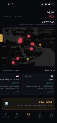
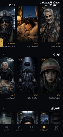
تدري منصّة عربية تتابع الملفّات الحسّاسة في الخليج والمنطقة، بمصادر يمكن التحقّق منها. لا رأي، بل مواد أوّليّة موزونة. ما ستجده: · دراسات مطوّلة موثّقة بمصادرها، بعيدًا عن ضجيج الأخبار العابرة. · فيديوهات قصيرة تشرح القصص المعقّدة في دقائق (منسّقة مع قنوات تدري على تيك توك وإنستقرام ويوتيوب). · الرصد الحيّ: خريطة تفاعليّة للاستهدافات، مؤشّرات توتّر ستّ (تصعيد إيران، هرمز، باب المندب، الشام-غزّة، العراق، سوق النفط). · بطاقات السيناريو: أسئلة «ماذا لو» بتقدير احتماليّ ولون واضح — أخضر للمرجَّح، أحمر للبعيد. · المنتدى: مجتمعات نقاش حول الملفّات نفسها (م/الخليج، م/إيران، م/الحوثي، م/التطبيع، م/العراق، م/الطاقة، م/OSINT). اشتراك VIP اختياريّ (٩٫٩٩$ شهريّاً، يُلغى في أيّ وقت من إعدادات آبل) يفتح: الرصد الحيّ، المنتدى، بطاقات السيناريو، الموجز الأسبوعيّ. نحن فريق مستقلّ يعمل من الكويت منذ ١٩٦١. المصادر تتكلّم، والتقدير في الدراسة نفسها. tadrygcc@gmail.com
App details
What you can learn from Tadry
Every shipping app on the App Store has gone through the same decisions you're working through right now: which screenshot goes first, what caption sits over it, which device frame to show, what color the background should be. The 7 screenshots above are Tadry's answers to those questions — they're public, they're real, and they made it through Apple's review.
What the numbers say: Tadry runs a dark set with one background colour (#0C0C0C) carried across every screenshot — the listing reads as a single poster when the shots sit side by side in search results. The accent colour we picked up, #C4A44C, is the one to reuse for badges, arrows and highlighted words if you borrow this look. Hit Use this style to open the editor with these exact colours and drop your own screenshot in.
Notice the first screenshot in particular. It's the one users see in search results and on the product page, and it's where most apps spend their best caption and tightest design. Look at the proportion of background to phone, where the text sits, what one thing the image is trying to communicate.
Want to see how other News apps approach the same problem? Browse more News apps in the showcase.
Take what works into your own screenshots
Open LaunchShots and design your App Store & Google Play screenshots — pick a device frame, drop captions, ship in minutes. Free, in your browser.
Open the screenshot editor →Apps with a similar look
Closest background + accent colours among the listings we've analysed — useful when you want to see the same palette handled by a different team.