Chart position — tracked daily by LaunchShots
Screenshot style breakdown
Sampled from 3 of 梁柱之间's App Store screenshots — background, accent and theme, measured by LaunchShots (not something Apple publishes).
#F4ECDC bg
#D6CFC1
#7C5C4C accent
#111111 text
Screenshots


iPad screenshots


Icon palette
About this app
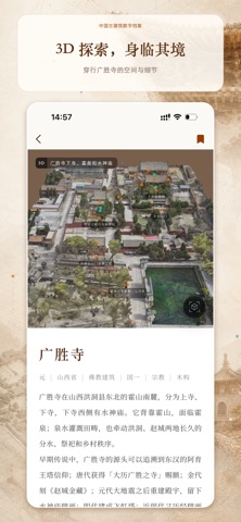
“梁柱之间”是一款记录和展示中国古建筑的应用。通过三维实景模型的交互,我们可以往返于建筑群全景和局部细节,连接详实的历史文献与高品质的建筑摄影,以前所未有的综合视角,进入古建筑的形制、构造、工艺与环境,认识一座建筑的尺度、秩序与时间痕迹。 【宝藏建筑,定期上新】 直达编辑部定期上线新收录的建筑。 【虚拟游览,身临其境】 穿梭于可交互的三维模型,在值得驻足的空间点位停留,自由观察整体和局部,游览单体建筑的精细模型或者室内360°全景。 【建筑摄影,定格细部】 按“形制·体量”“构造·工艺”等主题分区,并支持标签筛选。在图片详情页中,阅读相关联的知识和典故,还可以直接前往模型中的对应位置。 【特约文章,连通古今】 阅读历史延展与专题策划,让空间、影像与文字彼此补充。
App details
What you can learn from 梁柱之间
Every shipping app on the App Store has gone through the same decisions you're working through right now: which screenshot goes first, what caption sits over it, which device frame to show, what color the background should be. The 6 screenshots above are 梁柱之间's answers to those questions — they're public, they're real, and they made it through Apple's review.
What the numbers say: 梁柱之间 runs a mixed light-and-dark set where the background shifts from screenshot to screenshot (first shot #F4ECDC) — each image has to stand on its own, so the captions carry more of the story. The accent colour we picked up, #7C5C4C, is the one to reuse for badges, arrows and highlighted words if you borrow this look. Hit Use this style to open the editor with these exact colours and drop your own screenshot in.
Notice the first screenshot in particular. It's the one users see in search results and on the product page, and it's where most apps spend their best caption and tightest design. Look at the proportion of background to phone, where the text sits, what one thing the image is trying to communicate.
Want to see how other Reference apps approach the same problem? Browse more Reference apps in the showcase.
Take what works into your own screenshots
Open LaunchShots and design your App Store & Google Play screenshots — pick a device frame, drop captions, ship in minutes. Free, in your browser.
Open the screenshot editor →Apps with a similar look
Closest background + accent colours among the listings we've analysed — useful when you want to see the same palette handled by a different team.